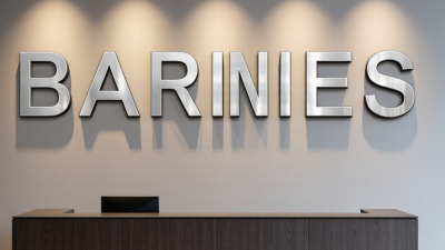
A clear office sign does more than label a room. It helps visitors find reception, recognize your brand, and feel confident they are in the right place. Acrylic is a popular choice because it can look crisp and polished without the visual weight of metal or wood. But the material alone does not make a sign effective. Size, contrast, lighting, and installation all matter.
The business case for signage is measurable, though the available figures need context. In its 2012 sign-impact survey, FedEx Office reported that 76% of consumers had entered a business they had never visited because of its signs. That finding concerns signs broadly, not acrylic office signs specifically. Still, it shows why clear visual communication deserves attention. Paul Rand, the influential graphic designer, put the broader principle simply: “Design is the silent ambassador of your brand.”
This guide explores Office Signs Acrylic options for reception areas, doors, directories, and branded walls. You will see where clear, frosted, colored, and dimensional styles work best, plus what to consider before ordering. A small detail can change the result. A glossy panel may look striking in a sample, then reflect overhead lights across its lettering. That is easy to overlook. Treat the examples as practical starting points, not universal rules; the right choice depends on your space, viewing distance, and maintenance needs.
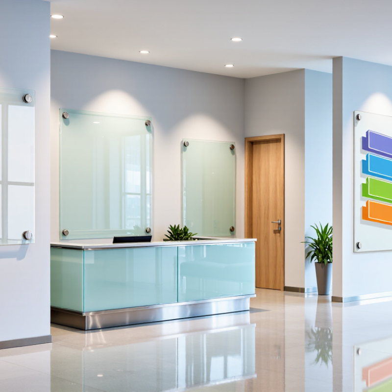
Acrylic office signs come in several forms, each serving a different purpose. Reception signs often use clear or colored panels with layered lettering, creating a crisp focal point in a lobby. Dimensional acrylic letters add depth to a feature wall, while flat plaques suit smaller offices and corridors. Keep it readable. Letter size and contrast matter more than decoration when visitors need to find a desk quickly.
Directory signs organize multiple suites or departments. Replaceable inserts help when teams move, though visible seams can look untidy if panels are poorly fitted. Room signs work well beside doorways, with clear labels for meeting rooms, private offices, and shared spaces. Suspended signs can guide visitors through open hallways, but need adequate clearance and should not compete with overhead lights. Small details matter.
For reception areas, back-painted acrylic can hide mounting hardware and create a smooth finish. Clear panels with standoff mounts feel lighter, but fingerprints and reflections show easily near windows. Matte finishes may be more forgiving. Acrylic is lightweight and can be cleaned with a soft cloth, yet abrasive pads may leave visible marks. Choose a sign based on viewing distance, wall color, lighting, and how often its information changes. The shiniest option is not always the practical one; that trade-off deserves a second look.
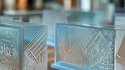
Acrylic signs serve practical roles throughout an office, from the reception desk to individual work areas. A clear or frosted panel behind reception can display the company name and help visitors identify where to check in. Room numbers and department names work well on doors, especially when the lettering contrasts clearly with the wall. Small details matter.
For wayfinding, wall-mounted arrows and floor directories can guide visitors toward meeting rooms, restrooms, or elevators. Keep wording brief and place signs near decision points, not only at the destination. In conference rooms, acrylic panels can show room names or booking details. Frosted finishes offer some visual privacy while still allowing light through, but they do not block sound. Acrylic can also show evacuation routes or office policies when the information is easy to read from a normal standing distance. One drawback is fingerprints: glossy panels may look polished in a mockup, then collect smudges near busy doorways. Check the finish under actual office lighting, since reflections can make fine text harder to read.
Top Acrylic Office Signs for Businesses?
How to Choose the Right Acrylic Sign
Choose an acrylic sign to suit its location, purpose, and viewing distance. A reception logo may need a polished, dimensional look, while a meeting-room label should be easy to read from the doorway. Measure the wall before ordering, and check for nearby lights or windows. Glare can make even clear lettering difficult to see. For a clean look, match the sign’s shape and finish to the room’s existing details.
Thickness affects appearance and mounting options. Thicker panels can create a more substantial effect, but they may need stronger hardware. Clear acrylic can look crisp against a painted wall; frosted panels soften reflections and add privacy. Ask for a material sample when color accuracy matters. Screen colors can be misleading. Also consider cleaning: gentle, non-abrasive products help reduce visible scratches. A sign that looks perfect in a mockup may feel too large on the actual wall, so review its scale before production.
Tips: Check measurements twice. View a sample under the room’s lighting. Confirm mounting points and wall type before installation. Keep text brief, with strong contrast and readable lettering. If visitors hesitate to find a room, the sign may need clearer placement—not just a better design.
| Sign Type | Typical Office Use | Common Panel or Letter Thickness | Mounting and Finish Options | Key Advantages | What to Consider | Best Choice When |
|---|---|---|---|---|---|---|
| Flat Wall Panel | Reception areas, office entrances, and branded interior walls | About 1/8–1/4 in (3–6 mm) | Adhesive mounting, concealed fixings, or standoffs; clear, white, colored, or printed panel | Clean appearance, versatile layout, and easy-to-read graphics | Large panels need suitable wall support; check that the wall surface is smooth and clean before installation | You want a straightforward sign with text, graphics, or a logo-style design |
| Standoff-Mounted Panel | Lobby feature walls, reception signs, and visitor-facing areas | About 1/4–3/8 in (6–10 mm) | Metal or acrylic standoffs create a gap between the panel and wall; clear, frosted, or colored acrylic | Creates depth and a more prominent, polished presentation | Requires accurately placed mounting holes and enough clearance behind the panel; standoffs are visible | You want a dimensional look and the sign will be viewed from the front |
| Dimensional Acrylic Letters | Reception desks, feature walls, and interior wayfinding | Commonly about 1/8–1/2 in (3–13 mm), depending on letter size and design | Individually mounted letters using spacers, adhesive, or templates; polished, painted, or layered finishes | Distinctive depth without a full rectangular sign panel | Small lettering can be harder to install and read; plan spacing and wall contrast before production | You want standalone text or symbols rather than a single flat panel |
| Frosted Privacy Sign | Glass meeting-room doors, partitions, and private office windows | Film is commonly applied to existing glass; separate acrylic panels are often about 1/8–1/4 in (3–6 mm) | Frosted acrylic panel or frosted film; applied directly to glass or mounted with discreet fixings | Improves privacy cues while allowing light to pass through a frosted surface | Frosting does not provide complete visual or acoustic privacy; confirm door glazing and safety requirements | You need room identification or a privacy marker on glass |
| Room Identification Plaque | Meeting rooms, offices, service rooms, and shared spaces | About 1/8–1/4 in (3–6 mm) | Adhesive or screw mounting; printed, engraved, or layered text on a clear or opaque panel | Compact, easy to update, and suitable for consistent room labeling | Use readable text size and strong contrast; leave room for future room-name changes if needed | You need a practical sign for a door or corridor wall |
| Directory or Wayfinding Panel | Building lobbies, office floors, and corridors | About 1/8–1/4 in (3–6 mm), with thicker panels possible for larger displays | Wall-mounted panel; printed or interchangeable inserts; matte, clear, or frosted finish | Organizes multiple destinations in one place and can help visitors navigate | Plan for readable type, logical grouping, accessible placement, and updates when occupants change | You need to direct visitors to several rooms, departments, or floors |
| Reception Desk Sign | Front desks, visitor check-in counters, and reception areas | About 1/8–1/4 in (3–6 mm) for a panel; thicker material may be used for a freestanding block | Freestanding base, desk-mounted panel, or small standoff display; clear, colored, or frosted finish | Places information at visitor eye level and can be installed without changing a wall | Choose a stable base and a size that does not obstruct the desk or visitor view | You want a visible sign at the point where visitors arrive |
Selection tip: Choose the sign type based on viewing distance, wall or glass surface, indoor lighting, and how often the information may change. Thickness and mounting needs vary with sign size, design, and installation conditions; confirm final specifications with the fabricator.
Acrylic office signs can make a reception area feel clear and considered, but the design should serve visitors before it decorates a wall. Choose lettering that remains readable from the doorway, not just on a computer screen. Keep it readable. High contrast, generous spacing, and a simple layout help people find room numbers, department names, or reception without stopping to study the sign. Frosted acrylic offers a softer look, while clear panels can appear to float when mounted with metal standoffs. A glossy finish may look polished in a sample, yet create distracting reflections under bright ceiling lights.
Customization can include panel shape, thickness, edge finish, color, printed graphics, and raised lettering. Match these details to the space: a narrow corridor may need a slim, uncluttered panel, while a large lobby can support a broader sign with more information. Before production, review a proof at the intended size and check spelling, alignment, and contrast. The first mockup is rarely perfect. Consider how the sign will be installed and cleaned, too; acrylic can scratch, and fingerprints show quickly on dark, glossy surfaces. A practical choice of finish and placement can keep a custom sign attractive and useful through everyday office traffic.
Acrylic office signs stay clear and professional when installed on a clean, stable surface. Wipe the wall with a lint-free cloth and let it dry before marking positions. Use a level, pencil, and tape measure to keep the sign straight. Small alignment errors show quickly under bright reception lighting. Check the wall material before drilling, and choose anchors that can support the sign’s weight. For lightweight panels, suitable mounting tape may work, but test a hidden area first. Follow the tape maker’s curing instructions. Do not overtighten screws; pressure can crack acrylic around the holes. Take your time.
For routine care, remove loose dust before wiping the surface. Use a soft microfiber cloth with mild soap diluted in water, then dry gently. Avoid abrasive pads, strong solvents, and ammonia-based cleaners, which can cloud or scratch the finish. Keep signs away from heaters and prolonged direct sunlight when possible. Inspect mounts occasionally, especially in busy hallways where signs may get bumped. A tiny scratch can be frustrating. I’ve found that rushing a cleanup often causes more damage than the dust itself, so use light pressure and check the cloth for grit before wiping.
Approximate weights are calculated using a typical acrylic density of 1.18 g/cm³. Thicker panels weigh more, so consider the sign’s size and suitable mounting hardware during installation. For routine care, wipe with a soft microfiber cloth and mild soapy water; avoid abrasive cleaners and solvents.