
Choosing the right Business Sign is a practical decision, not merely a branding exercise. It shapes what people notice before entering your store.
The FedEx Office 2012 Small Business Signs Survey reported that 76% of consumers had entered a store because of its sign. The same survey found that 68% had purchased something because a sign attracted them. These figures show why visibility, readability, and relevance deserve careful attention.
Industry research also supports this relationship. The Sign Research Foundation has published studies linking on-premise signs with stronger business visibility and consumer awareness. Its findings suggest that a well-designed sign can function as a continuing local advertisement. It works while the store is open and often while it is closed.
Location changes everything.
A roadside sign needs distance-friendly lettering and strong contrast. A storefront sign on a busy pedestrian street may need simpler messaging. At eye level, people may have only a few seconds to understand your offer. Small type, crowded graphics, or weak lighting can quietly reduce that opportunity.
Materials matter, too. Weather, sunlight, cleaning routines, and mounting conditions affect long-term performance. Professional sign designers usually consider these details before recommending acrylic, aluminum, illuminated lettering, or digital displays.
Still, no sign performs perfectly. A bright design may gain attention but weaken trust if it feels unrelated to the store. A cheaper option may also create higher replacement costs later. Business owners should compare visibility, durability, accessibility, maintenance, and local requirements before choosing.
The best Business Sign communicates quickly, reflects the brand honestly, and fits the surrounding environment. This guide explains how to evaluate those factors with practical judgment and reliable industry guidance.
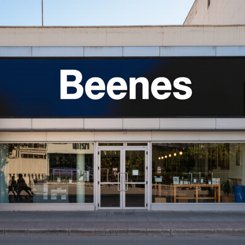
Before choosing a business sign, define what it must accomplish. A storefront sign may attract passing drivers, guide pedestrians, or make an entrance easier to find. These goals require different designs. A roadside sign needs strong contrast and quick recognition. An entrance sign can include more detail, such as opening hours or service categories.
Your audience should shape every visible decision. Consider their age, language preferences, shopping habits, and travel speed. A family café near a school may need warm colors and simple wording. A professional service office may require restrained typography and clear directional information. Visit the location at different times. Notice where people pause, how far away they can read, and whether trees or parked vehicles block the view.
I once assumed that a larger sign would always perform better. That assumption was wrong. Excessive size can overwhelm a narrow storefront and reduce readability. Measure the available wall space before selecting dimensions. Test the wording from the sidewalk, across the street, and from a moving vehicle when appropriate. Ask several real customers what they notice first. Their answers may expose weak contrast or confusing language. Leave room for revision. A sign should serve the audience, not merely display the owner’s preferences.

How to Choose the Right Business Sign for Your Store?
Sign choice should balance visibility, function, and brand fit. A fascia sign works well on busy streets because it faces passing traffic. Projecting signs help pedestrians notice entrances from the side. Window graphics support promotions, but crowded glass can hide products and make the store feel closed. In storefront audits, I often see owners prioritize size while ignoring viewing distance. Bigger is not always clearer.
A 2012 national consumer survey of 1,000 U.S. adults found that 76% had entered a store they had never visited because of its signs. The same research reported that 68% viewed signage as a quality signal. These figures support readable lettering, strong contrast, and consistent colors. For larger sites, monument signs improve property-level visibility. For changing offers, digital displays provide flexibility, although excessive motion can weaken brand recognition.
Function matters after the first glance. Directional signs should guide customers without competing with the main identity sign. Illuminated letters can improve evening visibility, while interior signs can reduce questions at checkout. Research from the University of Cincinnati’s Economics Center linked effective on-premise signage with potential sales increases of 5% to 15%. The result is not guaranteed. Store location, pricing, and execution still matter. A sign can look impressive in a design file and fail beside real traffic, trees, or glare. Test visibility from the customer’s approach. Then adjust.
Compare sign types for visibility, function, and brand fit
This comparative index uses a 1–10 scale based on common characteristics of each sign type. Channel letters and lightboxes generally provide strong visibility, projecting signs improve visibility from the side of a storefront, and awnings combine identification with practical functions such as shade and weather protection. Higher scores indicate stronger performance for the selected factor; the results are general guidance rather than company-specific data.
A business sign works before a customer enters your store. In a consumer survey cited by the Sign Research Foundation, 76% of respondents had entered a store because its sign attracted them. Another 68% said signage reflects a business’s quality. These figures make material selection more than a design preference.
Choose materials for weather, distance, and maintenance. Aluminum suits exposed storefronts because it resists rust and stays relatively light. Acrylic creates clean, bright faces, but it can scratch or crack under impact. Wood offers warmth, although moisture may demand regular sealing. I have seen attractive signs fail because their mounting hardware was overlooked. Small details matter.
Color should contrast strongly with the wall and remain recognizable at night. Dark lettering on a pale background often reads better than subtle, fashionable combinations. Keep the font simple. Decorative lettering can look elegant nearby, yet become unreadable across a parking lot. Make it readable. Test it at dusk.
Lighting should support visibility, not create glare. The U.S. Department of Energy reports that light-emitting diode lighting uses at least 75% less energy and lasts up to 25 times longer than incandescent lighting. Use even illumination around letters and inspect shadows from different angles. A dim corner can weaken the entire sign. My own preference is warm lighting, but that choice is not universal; nearby streetlights and your storefront colors may change the result. Test from the customer’s viewpoint.
How to Choose the Right Business Sign for Your Store?
Before choosing colors, materials, or lighting, check your local sign regulations. Cities often control sign height, width, placement, brightness, and projection from the building. Rules may change between commercial districts, historic areas, and shared shopping centers. A sign that fits one street may require approval on another.
Speak with the local planning office and review your lease requirements. Ask whether you need a permit, electrical inspection, landlord approval, or a licensed installer. Confirm wall strength, mounting points, wind exposure, and safe access for future repairs. Illuminated signs may require extra wiring protections and limits on operating hours. I have seen attractive signs delayed because installation details were checked too late. That mistake is avoidable, though regulations can still feel unclear.
Tips: Request written guidance before ordering materials. Keep drawings with exact dimensions, colors, lighting details, and mounting methods. Ask the installer to inspect the wall first. Do not rely only on a supplier’s promise that a sign is compliant. Local officials may interpret older rules differently, and informal advice is easy to misunderstand. Leave space for changes, too. Your first design may not be the final one. A careful review protects your budget and helps create a sign that looks appropriate, functions safely, and meets local requirements.
| Sign Type | Best-Fit Storefront Use | Typical Installation Method | Common Regulation Checks | Permit Likelihood | Key Installation Requirements | Recommended Verification |
|---|---|---|---|---|---|---|
| Wall-Mounted Cabinet Sign | Primary identification on a broad exterior wall; suitable when a larger, highly visible sign area is available. | Fastened to masonry, concrete, steel, or structural framing with engineered anchors appropriate to the wall material. | Maximum sign area, wall coverage, height, illumination, color, building setbacks, and restrictions in historic districts. | Often required | Confirm wall load capacity, anchor spacing, wind resistance, electrical disconnect access, and weatherproofing. | Ask the local planning or building department for the allowed sign area and structural submittal requirements. |
| Individual Letter Sign | Clean storefront branding where the façade should remain visible between letters. | Stud-mounted, raceway-mounted, or mounted directly to a backing panel; illuminated letters may require concealed wiring. | Letter height, total sign area, projection from the wall, brightness, wiring concealment, and permitted operating hours. | Often required | Use corrosion-resistant fasteners, seal wall penetrations, provide access to power supplies, and coordinate with the sign circuit. | Confirm whether the local code counts the letters individually or as one combined sign area. |
| Projecting or Blade Sign | Improves visibility to pedestrians approaching along the sidewalk or from a side street. | Attached perpendicular to the building using a bracket connected to structural framing or approved masonry anchors. | Projection limits, minimum clearance above sidewalks, distance from curbs, sign height, pedestrian safety, and wind load. | Often required | Maintain the authority’s required pedestrian clearance; use a structural bracket and protect electrical components from moisture. | Measure the sidewalk and curb location before design approval; local clearance rules vary substantially. |
| Awning or Canopy Sign | Combines weather protection with storefront identification and can be useful where wall space is limited. | Printed, applied, or dimensional lettering on a fixed or retractable awning supported by the building façade. | Sign area calculation, awning projection, clearance, flame resistance, attachment method, and historic-district appearance rules. | Sometimes required | Use a frame and fabric system rated for local weather; keep exits, windows, vents, and address numbers unobstructed. | Check whether the awning is regulated as a sign, a building projection, or both. |
| Window Graphics or Decals | Promotional messaging, opening hours, services, and temporary campaigns on storefront glazing. | Interior-applied or exterior-applied vinyl, perforated film, painted graphics, or removable decals. | Maximum percentage of window coverage, visibility for safety, sign area, temporary-sign duration, and placement on egress windows. | Sometimes required | Do not block required exits, emergency access, visibility triangles, fire equipment, or safety glazing markings. | Confirm the permitted coverage percentage and whether temporary graphics have a separate time limit. |
| Freestanding Monument Sign | Useful for detached stores, shopping centers, or sites set back from the public right-of-way. | Supported by a concrete foundation or engineered base installed on private property. | Site setback, total height, sign area, landscaping, visibility at driveways, easements, utilities, and property-line limits. | Often required | Locate underground utilities before excavation; design the foundation for soil conditions and local wind or seismic loads. | Obtain a site plan showing property lines, setbacks, driveways, utilities, landscaping, and nearby public rights-of-way. |
| Pole or Pylon Sign | High-visibility identification for large sites where the sign must be seen above vehicles or landscaping. | Steel or aluminum support structure anchored to a reinforced concrete foundation. | Maximum height, area, spacing, wind and seismic design, illumination, airport or roadway restrictions, and zoning limitations. | Often required | Requires professional structural design in many jurisdictions, plus utility-location review and safe access for maintenance. | Confirm whether the zoning district permits freestanding signs and whether a variance or special approval is needed. |
| Electronic Message Sign | Time-sensitive announcements, prices, services, or public-facing information that changes regularly. | Integrated into a monument, cabinet, or freestanding sign with a dedicated electrical and control system. | Brightness, dimming, animation, message duration, nighttime operation, driver distraction, spacing, and prohibited flashing effects. | Often required | Use automatic brightness control where required; provide secure access, surge protection, ventilation, and a service disconnect. | Review the current sign ordinance for electronic-display rules before purchasing the display hardware. |
| Temporary Banner or Promotional Sign | Grand openings, seasonal promotions, clearance events, or short-term announcements. | Mounted with approved straps, frames, or temporary supports; installation must not damage the façade or obstruct access. | Permit duration, number of events per year, banner size, attachment method, wind safety, and prohibited locations. | Sometimes required | Use reinforced hems and secure fasteners; remove promptly when the approved display period ends. | Record the approval start and expiration dates and check whether renewal is permitted. |
| Directional or Parking Sign | Guides customers to entrances, loading areas, accessible parking, and customer pick-up locations. | Wall-mounted, post-mounted, or installed on a small ground support within private property. | Traffic visibility, driveway sight lines, accessible-parking standards, sign height, colors, symbols, and public-right-of-way restrictions. | Sometimes required | Keep signs outside required accessible routes and maintain visibility for drivers and pedestrians. | Coordinate with site-plan, accessibility, fire-safety, and traffic requirements rather than reviewing the sign alone. |
Planning note: Permit requirements, sign dimensions, projection limits, illumination rules, accessibility clearances, and installation standards differ by jurisdiction and property type. Verify the current requirements with the local planning, zoning, building, electrical, and accessibility authorities, and obtain property-owner approval before fabrication or installation.
Set aside an annual maintenance allowance before approving the design. Inspect the sign every three to six months. Look for loose fasteners, faded surfaces, damaged wiring, water marks, and dark lighting sections. Small problems are easier to fix. They are also cheaper.
Keep a simple record of inspection dates and repair costs. This creates useful evidence for future budgeting.
Think beyond opening day. Choose materials that suit your local weather and cleaning routine. Ask the installer about expected service life, replacement parts, access equipment, and safe electrical servicing. Confirm local display requirements before production, because changes after installation can increase costs.
A repair plan should include emergency access, but it should not depend on guesswork. My own planning has sometimes underestimated cleaning time. That mistake matters when staff must use ladders or close the storefront. Recheck the plan each year. Conditions change, and a sign that looked practical may become expensive.