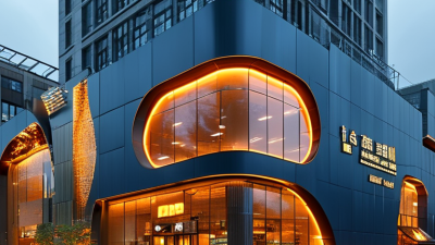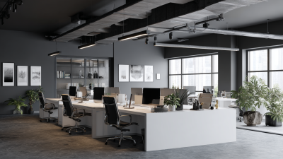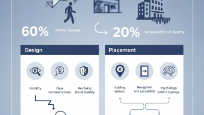
Choosing Office Building Signs is not merely a branding exercise. It shapes how visitors find reception, trust a company, and move through a busy property. A clear sign outside can reduce hesitation before the first conversation. Inside, consistent room labels, directory panels, and directional signs create a calmer arrival experience.
Industry research supports this practical connection. The FedEx Office and Ketchum Global Research & Analytics survey reported that 76% of consumers entered a business because its sign attracted them. It also found that 68% viewed business signage as a quality indicator. These figures are older, but they remain useful reminders. A neglected sign can weaken confidence before staff have any opportunity to help.
The International Sign Association’s economic research also describes on-premise signs as important communication assets for businesses. However, numbers should not replace judgment. Building type, visitor behavior, viewing distance, lighting, and local accessibility requirements all affect the right choice. A polished lobby sign may look impressive, yet fail when visitors cannot read it from the elevator. That happens.
This guide explains how to evaluate Office Building Signs through visibility, materials, placement, maintenance, accessibility, and brand consistency. It considers the details people experience: glare on brushed metal, cramped lettering, confusing floor directories, and poor nighttime contrast. The aim is not to select the largest sign. It is to select signage that works reliably, welcomes different visitors, and supports the building’s daily rhythm.
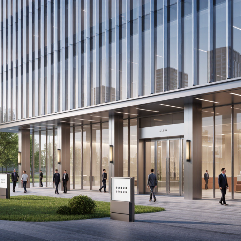
Choosing office building signs starts with the zone, not the sign material. Reception areas need welcoming identification signs and clear room names. Corridors need directional arrows that remain readable from several steps away. Service zones may require quieter, functional labels. In my site audits, visitors often miss signs placed too high or beside busy artwork. Test each sign from a standing visitor’s view. A polished sign can still fail if the next decision is unclear. I once approved a corridor map that looked accurate, but it lacked a “You are here” marker. That small omission created repeated questions.
Visitor type changes the wording, size, and placement. First-time guests need simple destinations, not internal department language. Couriers may need a direct delivery route. Employees usually need fewer prompts because they know the building. Watch traffic during busy periods, not only during a quiet inspection. Signs should appear before decision points, with enough distance for people to slow down safely. Use consistent colors, arrows, and room numbering. Yet consistency can become rigid. An arrow may point correctly but still confuse people at a split corridor. Recheck it with someone unfamiliar with the floor.
Tips: Map the building into zones. Mark every entrance, lift, stair, reception desk, and intersection. Record who uses each route. Photograph sightlines at eye level. Ask three people to find the same room without help. If they hesitate, revise the sign, not the visitor. Check contrast, lighting, mounting height, and accessibility needs before production. Keep a change log, because tenant moves can quietly make old signs unreliable.

Office building signs should support quick recognition, safe navigation, and independent access. For U.S. projects, the 2010 ADA Standards require tactile signs for permanent rooms and spaces. Raised characters must be at least 1/32 inch high. They must use uppercase lettering with clear, non-decorative forms.
Grade 2 Braille is required, not optional. It uses contractions, so the message occupies less space. The dots must be rounded and accurately spaced. The U.S. Access Board’s ADA technical guidance specifies Braille placement beneath the corresponding text. A sign can look polished and still fail inspection.
Placement matters just as much. Tactile characters must sit between 48 and 60 inches above the finished floor. Install the sign beside the door, usually on the latch side, and keep it outside the door swing. A person should find it without standing in a doorway.
The CDC’s Disability and Health Data System reports that roughly one in four U.S. adults has a disability. The World Health Organization’s 2022 Global Report on Health Equity for Persons with Disabilities estimates 1.3 billion people worldwide experience significant disability. These figures make accessibility a practical design issue, not a minor detail.
Use strong contrast and matte finishes, even when the code does not specify exact colors. Test the sign from a seated position and under dim hallway lighting. That extra check is easy to skip. It should not be. Verify local building requirements before production, because ADA compliance alone may not cover every jurisdiction.
Letter height directly affects how quickly visitors recognize your office. A useful starting point is the 1-inch-per-10-feet visibility rule. For every 10 feet of viewing distance, allow about 1 inch of letter height. If drivers see your sign from 100 feet away, 10-inch letters may be appropriate. Measure from the actual approach path, not only from the building entrance. A sign viewed through glass, landscaping, or traffic needs extra attention. Contrast, lighting, and letter spacing also influence readability. The rule helps, but it is not perfect.
I once evaluated a sign using distance alone. The calculation looked correct, yet smaller letters disappeared against a bright wall. That mistake changed the recommendation. Darker lettering, wider spacing, and a clearer mounting position improved visibility. Consider the reader’s height and viewing angle. A sign above a lobby door may need taller letters than one at eye level. Test a paper mock-up from the sidewalk. It may reveal problems drawings miss. Sometimes, a slightly larger letter is the safer choice.
Tips: Identify the farthest point where visitors need to read the sign. Add distance for turns, glare, and poor weather. Use simple words and strong contrast. Ask someone unfamiliar with the building to read a temporary version. Their hesitation matters. Recheck the sign at morning, noon, and evening. Conditions change.
Choosing office building signs starts with the building’s conditions, not only its appearance. Aluminum offers strong weather resistance and a light structure. Stainless steel feels premium but may require careful cleaning near coastal air. Acrylic creates clean, bright faces, yet it can scratch or crack under impact. Wood adds warmth, though it needs more frequent sealing outdoors. My first material choice is not always right. Sun exposure, cleaning habits, moisture, and visitor traffic can change the result.
Tips: Request samples before approval. Rub the surface lightly with a soft cloth. Check edges, fasteners, and color consistency. Ask how the sign handles heat and water. Confirm local installation rules with a qualified professional. A small sample can reveal glare that drawings hide.
For illuminated signs, a 50,000-hour LED life rating sounds impressive. It equals about 5.7 years of continuous operation. In real offices, daily use may extend that period. However, heat, power quality, ventilation, and LED drivers affect actual performance. Choose a design with accessible components and replaceable drivers. Inspect brightness, flicker, loose wiring, and dirt twice yearly. Use non-abrasive cleaners and follow the installer’s maintenance instructions. A rating is not a guarantee. It is a useful benchmark, but only when operating conditions match the test conditions.
| Sign Material | Typical Indoor / Outdoor Use | Durability | Maintenance Requirements | Moisture & Corrosion Resistance | Appearance Longevity | Best Fit for Office Buildings |
|---|---|---|---|---|---|---|
| Powder-Coated Aluminum | Interior directories, exterior fascia signs, building identification panels | High | Clean with mild soap and water. Inspect coating, fasteners, and edges periodically. | High; aluminum does not rust, and powder coating adds surface protection. | Typically maintains a clean, professional finish when the coating is properly specified and installed. | Strong all-purpose choice for durable, lightweight, low-maintenance exterior signage. |
| Stainless Steel | Premium lobby signs, dimensional letters, entrance signs, exterior architectural signage | Very high | Wipe regularly with a non-abrasive cleaner. Remove fingerprints, salt, and construction residue. | Very high; corrosion resistance depends on grade, finish, and environmental exposure. | Excellent for polished, brushed, or satin finishes; surface scratches may be visible over time. | Best for high-visibility entrances and premium corporate environments requiring a substantial appearance. |
| Acrylic | Lobby plaques, room signs, illuminated panels, interior branding features | Medium to high | Use a soft microfiber cloth and mild soap. Avoid abrasive cleaners and solvents that can damage the surface. | High; it does not rust and performs well in normal indoor and sheltered applications. | Clear and colored finishes remain attractive indoors; outdoor exposure can increase scratching and weathering. | Well suited to modern interior signs and illuminated designs where clarity and color are important. |
| Polycarbonate | Impact-prone areas, protective sign faces, exterior illuminated signs | High impact resistance | Clean with mild soap and water. Use a soft cloth because some surfaces can scratch. | High; suitable for damp locations when edges, joints, and electrical components are properly protected. | Good functional longevity; UV-resistant grades are preferable for prolonged outdoor exposure. | Useful where impact resistance and safety are more important than a glass-like surface. |
| PVC / Expanded PVC | Interior room signs, temporary directories, low-cost wall graphics, sheltered applications | Medium | Simple wipe-down cleaning. Protect from excessive heat, strong sunlight, and harsh chemicals. | Good in normal conditions, but prolonged outdoor exposure can affect dimensional stability and finish. | Generally better suited to indoor use; finish and rigidity may decline faster in demanding exterior environments. | A practical budget option for indoor signs and projects where low weight is important. |
| Cast or Machined Metal | Dimensional letters, lobby logos, donor walls, architectural entrance signs | High | Inspect mounting points and clean according to the metal finish. Painted or plated surfaces may need refinishing eventually. | Varies by metal and finish; protective coatings may be required for outdoor use. | Provides a long-lasting dimensional appearance when the selected metal and finish match the environment. | Ideal for durable, upscale lettering and signs that need visual depth rather than a flat panel. |
| LED illumination reference: A 50,000-hour LED rating equals approximately 5.7 years of continuous operation, 11.4 years at 12 hours per day, or 17.1 years at 8 hours per day. Actual service life depends on heat management, power quality, driver performance, installation conditions, and cleaning practices. LED ratings generally indicate expected operating life to a defined light-output level, not a guarantee that every component will operate for the full period. | ||||||
| Selection guidance: For most exterior office building signs, powder-coated aluminum offers a balanced combination of weight, corrosion resistance, durability, and maintenance efficiency. Choose stainless steel or dimensional metal when premium appearance and impact resistance are priorities; choose acrylic or polycarbonate when illuminated faces and design flexibility are more important. | ||||||
Choosing office building signs begins with access, not aesthetics. The CDC reports that about 1 in 4 U.S. adults has a disability. Clear, usable signage therefore serves real people, every day. The U.S. Access Board’s ADA Standards require tactile signs to sit between 48 and 60 inches above the finished floor. Measure to the tactile characters, not the sign’s top edge.
Small errors matter. A sign beside a door may hit a closer, wall guard, or furniture. During installation, mark the floor, measure the lowest and highest tactile characters, and check viewing distance. Braille should sit below the matching text. Keep the sign on the latch side when possible. If the door swings toward the sign, pause and review the layout.
Local checks remain essential. Municipal amendments, fire codes, historic-building rules, and landlord standards can change placement requirements. The 2024 International Building Code also addresses accessible routes and maneuvering clearances, but local adoption varies. Ask the authority having jurisdiction before fabrication. A site walk with the installer can prevent expensive rework. It is not glamorous, but it works. I have found that drawings often miss wall thickness, uneven floors, or concealed utilities. Recheck field conditions before drilling. A perfect measurement on paper may still fail in the hallway.