Leave Your Message

What Are the Top 10 Illuminated Building Signs?

Illuminated Building Signs do more than identify a property after sunset. They shape first impressions, guide visitors, and strengthen local brand recognition. A well-designed sign can glow across a busy street without creating harsh glare. Its lettering should remain clear from a moving car, a nearby sidewalk, or an upper-floor window. Materials matter too. Powder-coated aluminum, acrylic faces, stainless-steel trims, and weather-sealed LEDs each perform differently in rain, heat, and winter cold.

This guide examines ten leading sign styles used on offices, retail spaces, hotels, campuses, and public buildings. It considers visibility, energy use, maintenance access, color consistency, and installation quality. Halo-lit letters may create a refined outline, while front-lit channel letters often deliver stronger distance visibility. Cabinet signs can cover large façades, but their proportions need careful review. Digital displays offer flexibility, although brightness control and content discipline are easy to overlook.

Real projects rarely fit a perfect ranking. A beautiful sign can still fail when wiring is difficult to reach or contrast is too weak. I have also seen modest signs outperform expensive designs because they matched the building and viewing distance. That is worth remembering. The final selections balance appearance with practical reliability, based on common commercial applications and experienced sign-planning principles. Local approvals, structural conditions, and accessibility expectations should always be checked before installation.
What Are the Top 10 Illuminated Building Signs?

Define the Top 10 Illuminated Signs by Visibility, Safety, and Energy Use

What Are the Top 10 Illuminated Building Signs?

The top 10 are channel letters, cabinet signs, monument signs, pylon signs, pole signs, directional signs, blade signs, halo-lit signs, backlit panels, and digital displays. Their value depends on visibility, safety, and energy use, not appearance alone. Channel letters and halo-lit signs create sharp recognition on building façades. Cabinet and backlit signs offer readable blocks of information from longer distances. Monument and pylon signs help drivers identify entrances, while directional signs reduce hesitation near busy driveways. Blade signs work well for pedestrians. Digital displays are highly visible, but brightness requires careful control.

Visibility changes with viewing distance, contrast, mounting height, weather, and nighttime glare. The Illuminating Engineering Society recommends evaluating luminance, uniformity, and surrounding light levels rather than relying on brightness alone. Excessive brightness can reduce legibility and disturb nearby road users. That is an often-missed safety issue. The Federal Highway Administration also emphasizes clear sign placement, contrast, and adequate sight distance for traffic-related information. Local rules still matter.

Energy performance separates practical signs from expensive lighting features. The U.S. Department of Energy reports that LED technology can use at least 75% less energy and last up to 25 times longer than incandescent lighting. ENERGY STAR data also shows that efficient illuminated exit signs can reduce electricity use dramatically. However, digital displays may consume more power than static signs, especially with high brightness and continuous animation. The strongest design uses efficient LEDs, automatic dimming, sealed components, and scheduled operating hours. Rankings remain imperfect because a small pedestrian sign and a roadside pylon serve different audiences.

Compare Channel Letters, Lightboxes, and Backlit Panel Signs

What Are the Top 10 Illuminated Building Signs?

The ten most useful illuminated building signs include channel letters, lightboxes, backlit panel signs, halo-lit letters, cabinet signs, pylon signs, monument signs, marquee signs, exposed-tube signs, and digital message panels. Each format creates a different nighttime impression. In my field experience, channel letters often suit retail façades because each letter carries its own light. They look clean from the street and allow flexible spacing. However, narrow letters can be difficult to service when LEDs fail.

Lightboxes Lightboxes provide strong, even visibility across large logos or names. A printed translucent face can show detailed colors, while internal lighting keeps the message readable after sunset. They need enough depth for balanced brightness. Shallow boxes may create hot spots, especially with uneven LED placement. That detail is easy to overlook.

Backlit panel signs create a softer architectural effect. Light passes around raised letters or behind a solid panel, producing a controlled halo. They work well on stone, metal, and textured walls. Channel letters usually attract more direct attention, while lightboxes deliver broader visual impact. Backlit panels feel more refined, but their contrast may weaken in bright surroundings. I have seen attractive designs lose clarity because the panel color was chosen indoors. Daylight testing matters. So does checking viewing distance, weather exposure, access for repairs, and local installation requirements before fabrication.

Evaluate Pylon, Monument, Halo-Lit, and Neon Signs by Location

What Are the Top 10 Illuminated Building Signs?

Location determines whether an illuminated sign guides customers or disappears into visual clutter. Pylon signs suit highways, shopping centers, and large setbacks. Their height improves visibility, but excessive brightness can compete with nearby businesses. Monument signs work better at entrances, campuses, and office parks. They feel permanent and remain readable at slower driving speeds.

Halo-lit signs
Neon signs

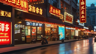
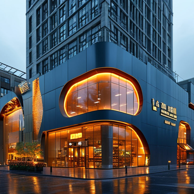
Halo-lit signs suit hotels, offices, and upscale urban facades. Their soft edge glow adds depth without overwhelming pedestrians. Neon signs perform well in restaurants, entertainment districts, and creative retail streets. They attract attention at night, although poor tube spacing can reduce legibility. In field evaluations, viewing distance, mounting height, and surrounding light often matter more than sign style.

The Sign Research Foundation and University of Cincinnati Economics Center reported that 67% of surveyed consumers connected on-premise sign quality with business quality. That finding supports investing in readable, well-positioned signs, not simply brighter ones.

The U.S. Department of Energy reports that LED lighting can use at least 75% less energy and last up to 25 times longer than incandescent lighting. LED illumination suits pylon and monument cabinets, while halo-lit systems need careful spacing around letters.

One weakness remains: designers sometimes judge signs from the sidewalk only. A sign may look elegant nearby but vanish across a six-lane road. Testing at actual approach distances is essential, and even then, weather can expose assumptions.

Assess Digital Displays and Marquee Signs Using 5,000-Nit Benchmarks

What Are the Top 10 Illuminated Building Signs?

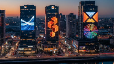
The strongest options include channel letters, halo-lit letters, lightboxes, LED cabinets, digital displays, marquee signs, blade signs, monument signs, pylon signs, and illuminated awnings. Their performance changes sharply with viewing distance and daylight. A 5,000-nit benchmark equals 5,000 candelas per square metre. It suits bright outdoor locations, especially glass-fronted buildings and roadside entrances. However, maximum brightness is not always better. Excessive output can create glare, wash out nearby details, and reduce nighttime comfort.

The International Commission on Illumination highlights adaptation and disability glare in CIE 150:2017. EN 12966 also classifies sign luminance for different conditions. These standards support a measured approach, rather than a simple “brighter is better” rule. The U.S. Department of Energy’s 2023 solid-state lighting report identifies laboratory LED efficacy above 200 lumens per watt. That figure does not guarantee efficient signage, though. Poor thermal design, dirty covers, and automatic dimming errors still waste energy. Field teams often discover uneven brightness at corners. It looks minor, but viewers notice it quickly.

Tips: Test digital displays at 5,000 nits during peak sun, then inspect them after sunset. Use ambient-light sensors and schedule gradual dimming. Check viewing angles from the pavement, not only straight ahead. Marquee signs may need less brightness because their exposed lamps already attract attention. Keep a measured lux and luminance log. It makes future decisions easier, even when the first installation was imperfect.

Measure LED Sign Efficiency Against the DOE’s 75% Energy-Saving Data

What Are the Top 10 Illuminated Building Signs?

The most common illuminated building signs include channel letters, cabinet signs, halo-lit letters, lightboxes, monument signs, pylon signs, blade signs, directional signs, roof signs, and digital displays. Their visual impact varies, but energy performance depends on more than appearance. During site audits, I check input watts, operating hours, brightness, and control settings. A bright sign can still waste electricity.

The U.S. Department of Energy reports that LED lighting can save up to 75% energy compared with incandescent lighting. This figure is a useful benchmark, not a guaranteed result for every sign. A 120-watt LED cabinet sign running 12 hours daily uses about 526 kilowatt-hours yearly. An incandescent design using 480 watts would consume about 2,102 kilowatt-hours. The difference is substantial.

Measure real performance at the sign circuit. Record wattage with a power meter, then compare annual use against the sign’s illuminated area. Efficient systems usually combine LEDs, reflective interiors, timers, photocells, and properly spaced modules. Do not over-light the fascia. It creates glare and wastes power. Maintenance also matters. Dusty lenses, damaged seals, and aging drivers can reduce useful brightness.

My measurements are not always perfect. Weather, voltage, and seasonal schedules can distort results. A sign may meet the 75% benchmark on paper, yet perform poorly after careless installation. That deserves another inspection.