How to Choose Office Building Signs for Your Business
Choosing Office Building Signs is a practical decision, not merely a branding exercise. The right system helps visitors find reception, meeting rooms, elevators, and emergency exits without hesitation. It also reflects your company’s standards before anyone says hello. A polished lobby sign can feel welcoming. A poorly placed directory can create confusion within seconds.
David Gibson, a recognized wayfinding consultant and author of The Wayfinding Handbook, writes, “Wayfinding is the process of using spatial and environmental information to navigate.” His principle matters in every commercial building. Signs must support movement, not compete with it. Consider viewing distance, lighting, letter height, contrast, mounting position, and the building’s daily traffic. A visitor carrying coffee needs simple directions. A delivery driver needs a visible entrance marker. Employees may need consistent room labels across several floors.
Experience also reveals a less comfortable truth. Attractive signs can still fail. I have seen directories installed beside busy doors, where opening panels blocked the information. Some signs looked excellent in drawings but became difficult to read under reflective glass. That gap deserves honest review. Measure the space, test sample materials, and ask unfamiliar people to follow the directions. Their hesitation may reveal more than a design meeting.
This guide explains how to compare materials, layouts, accessibility features, and installation methods. It also considers maintenance, future department changes, and brand consistency. The goal is not the loudest sign. It is a dependable visual system that works quietly, every day.
Assess Building Sign Needs Using ADA 2010 and ICC Accessibility Criteria
Choosing office building signs starts with access, not aesthetics. The CDC’s 2023 Disability and Health Data System reports that about one in four U.S. adults has a disability. That figure makes accessible wayfinding a practical business need. Under the ADA 2010 Standards, permanent room and directional signs generally need raised characters and Grade 2 Braille. Mount tactile characters between 48 and 60 inches above the finished floor. Place signs beside doors, not on moving panels. Their surface should avoid glare, and character contrast must remain clear under ordinary lighting.
The ICC A117.1 accessibility criteria add useful technical detail for sign placement, visual character dimensions, and tactile readability. A compliant-looking sign can still fail when a corridor is crowded, lighting changes, or furniture blocks the wall. The U.S. Access Board’s accessibility guidance also emphasizes consistent routes and detectable information. Measure from the finished floor, check viewing angles, and test signs with real users. Small errors matter.
Tips: Create a sign schedule before ordering. Mark every accessible route on the floor plan. Use simple wording, strong contrast, and familiar symbols. Check restrooms, stairs, exits, elevators, and meeting rooms separately. Local building officials may apply adopted ICC editions differently. Confirm requirements with the authority having jurisdiction. I have learned that a clean drawing is not proof of usability; a second site review often catches what the first inspection misses.
Calculate Sign Size and Legibility with the 1-Inch-per-10-Feet Rule
How to Choose Office Building Signs for Your Business
The 1-inch-per-10-feet rule offers a practical starting point for office sign sizing. If drivers or visitors read a sign from 100 feet away, use letters about 10 inches tall. For a 40-foot lobby view, four-inch characters may work. Measure the real viewing distance, not the distance shown on a floor plan. Corners, glass reflections, and reception furniture can reduce readability.
The rule is not a guarantee. The 2010 ADA Standards for Accessible Design use viewing-distance tables and minimum character dimensions, showing that distance must be assessed with letter height and visual conditions. Contrast, stroke width, spacing, lighting, and font shape also matter. A 2023 report from the Sign Research Foundation notes that on-premise signage can influence customer behavior; its earlier economic study found 60% of surveyed businesses reported increased sales, transactions, or profits after adding or improving signs, with an average increase of 10%.
In practice, print the proposed sign at full scale and test it from the entrance, parking area, and elevator. I have seen attractive signs fail because thin lettering disappeared under afternoon glare. Dark letters on a light background often perform better, but lighting can reverse that result. Keep key words short. Avoid squeezing six words into a narrow panel. A slight oversize is usually safer than a barely readable sign. The 1-inch rule helps control costs, yet real-site testing remains necessary.
Office Building Sign Size Guide
Using the 1-inch-per-10-feet rule of thumb, a sign should have approximately 1 inch of letter height for every 10 feet of viewing distance. For example, viewers standing 60 feet away would need letters about 6 inches high for improved legibility.
Select Materials and Illumination for Office Visibility and Energy Efficiency
Choosing office building signs starts with the building’s viewing conditions, not a catalog photograph.
During a site visit, observe the entrance at morning, noon, and dusk. Note reflected sunlight, deep shadows, rain exposure, and the distance between pedestrians and the sign. I once preferred a glossy face for its crisp appearance. It later reflected headlights and became difficult to read. Matte finishes can be less dramatic, but often improve practical visibility.
Material selection affects durability, maintenance, and energy use.
Powder-coated aluminum offers a stable, lightweight enclosure for many exterior applications. Acrylic faces can distribute light evenly when paired with carefully spaced LEDs. Unlit lettering may suit a bright lobby, while halo illumination creates a softer edge on darker walls. Test samples at full scale. Small samples hide glare and uneven brightness. That mistake is easy to make.
For efficiency, specify efficient LEDs, timers, dimming controls, and photocells that respond to outdoor light.
Avoid excessive brightness; it wastes power and can reduce legibility through glare. Ask the fabricator for illumination tests, expected service intervals, and cleaning instructions. Check wiring, mounting, accessibility, and local electrical requirements with qualified professionals. A sign that saves energy but fails during a storm is not a reliable investment. Reconsider the design after installation. Real conditions may expose weaknesses no drawing showed.
Plan Wayfinding with Consistent Icons and a 70% Light-Reflectance Contrast
How to Choose Office Building Signs for Your Business
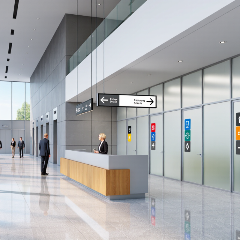
Effective office signs begin with a clear wayfinding plan, not attractive graphics alone. Visitors should understand where to go from the lobby, even during busy periods. Use one icon style for entrances, elevators, restrooms, meeting rooms, and emergency routes. Keep shapes, line weights, and meanings consistent throughout the building. A familiar visual language reduces hesitation near corridors and doorways.
Light-reflectance contrast deserves careful attention. Aim for about 70% contrast between sign text and its background where accessibility guidance recommends it. This makes lettering easier to distinguish under changing light conditions. Test samples in the actual building, including dim hallways and bright windows. Measure contrast with suitable tools instead of relying only on visual judgment. Requirements can vary by location, so confirm current accessibility standards with a qualified professional. I have seen signs appear clear in a showroom but become difficult to read beside polished floors.
Tips:
Place directional signs before decision points, not after them. Use simple icons beside short words. Avoid decorative backgrounds behind essential information. Check viewing distance from a seated position and from standing eye level. Ask several people unfamiliar with the building to follow the signs. Their confusion may reveal a flaw your design team missed. Rechecking the route after installation is worthwhile, because furniture, glare, and open doors can change the experience. Some plans still need revision.



 Inquiry
 Email
Email WhatsApp