
Leave Your Message

How to Choose Medical Office Signs in 2026?

Choosing Medical Office Signs in 2026 means balancing clear directions, patient comfort, and practical upkeep. A visitor may arrive worried, late, or unfamiliar with the building. Signs should make the next step easy to spot, from the entrance to reception, examination rooms, and exits. Think about what patients see at eye level, where corridors split, and whether glare makes lettering hard to read. Small details matter. A room number hidden behind an open door can cause real confusion.

This guide looks at how to assess sign types, materials, lettering, colors, lighting, and placement before making a purchase. It also considers the needs of older adults, people with low vision, and patients who may not read the clinic’s primary language fluently. Requirements can vary by location and building, so confirm applicable accessibility and safety standards with qualified professionals. Do not rely on a sign vendor’s general advice alone. Ask for samples, installation details, cleaning guidance, and a proof showing the sign at its intended size. That can change everything. A design that looks crisp on a laptop may be difficult to read across a crowded lobby. Budget matters, but replacement costs and maintenance deserve attention too. The right choice is rarely the flashiest one. It is the sign patients can understand when they need it most.
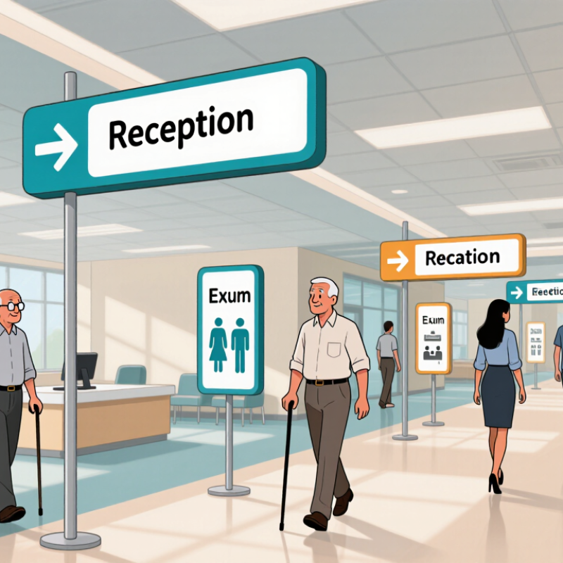
How to Choose Medical Office Signs in 2026?

Understanding the Signage Needs of a Medical Office

How to Choose Medical Office Signs in 2026?

Understanding the Signage Needs of a Medical Office

A medical office sign should reduce uncertainty at a stressful moment. Patients may arrive late, feel unwell, or struggle to read small print. Clear directions from the entrance to reception, elevators, and exam rooms can prevent confusion. Use familiar words, readable lettering, and strong contrast. Small details matter.

Different areas need different messages. A quiet “Please check in” sign can guide visitors at reception, while a discreet label may identify staff-only spaces. Waiting rooms benefit from clear reminders about check-in and seating. Avoid crowding signs with several instructions. People rarely stop to study a wall of text.

The best choices come from observing how people actually move through the office. Notice where visitors pause, ask for help, or turn the wrong way. Ask reception staff which questions they answer repeatedly. That sounds obvious, but it is easy to design from a floor plan and miss what patients experience. Needs also vary: a clinic serving many languages may need translated directions, while glare near a window can make even large lettering hard to read. Review the signs after installation, and adjust what is not working. A sign can look clear on screen and still confuse someone in the hallway.


Exploring the Main Types of Medical Office Signs

Medical office signs work best as a connected system. Exterior identification signs help patients find the entrance, while directories and directional signs guide them from reception to labs, imaging, or exam rooms. Room signs identify destinations; privacy and safety signs clarify where visitors should wait or avoid entry. Keep wording short, use familiar terms, and pair text with clear symbols. A small arrow at a corridor junction can prevent more confusion than another large directory.

Readability matters. The U.S. Department of Education’s 2003 National Assessment of Adult Literacy found that 36% of U.S. adults had basic or below-basic health literacy; only 12% were proficient. That is a strong reason to avoid unexplained abbreviations and dense instructions. Use high contrast, readable type, and consistent placement. For permanent rooms, check applicable accessibility standards for tactile characters and Braille. Still, more signs are not always better. A plan can look clear on paper and fail beside a noisy waiting room. Walk the route with first-time visitors, note where they pause, and revise those specific signs.

Checking Accessibility, Privacy, and Regulatory Requirements

In 2026, choose medical office signs by checking how patients move through the space and what local rules require. Start at the entrance, then follow the route to reception, restrooms, and exam rooms. Signs should be easy to read from a seated position, with clear contrast and lettering that remains legible under bright or uneven lighting. Where required, include tactile characters and Braille. Keep signs clear of door swings and other obstructions. Test the route in person. A floor plan alone can miss glare or confusing turns.

Privacy deserves equal attention. Use discreet labels such as “Check-in” or “Staff Only,” rather than displaying patient names, diagnoses, or appointment details in public areas. Position screens and queue instructions so visitors are not encouraged to read information meant for someone else. Keep it simple. Even a well-intended sign can expose more than it should.

Requirements vary by location, building type, and the services provided. Check applicable accessibility, fire-safety, and health-facility rules with the relevant local authority before ordering permanent signs. Review wording, placement, mounting height, and symbols with facilities staff and, when possible, people who use mobility aids or have low vision. A sign may satisfy a checklist yet remain confusing in real life. That gap is worth noticing—and correcting.

Comparing Materials, Visibility, and Digital Signage Options

Choosing medical office signs starts with the distance and conditions in which patients must read them. Acrylic and aluminum offer clean, durable surfaces for reception areas and corridors. Acrylic looks polished. Aluminum handles frequent cleaning and everyday bumps well, though its finish can feel less warm. For temporary notices, printed inserts are easy to update, but they can look untidy if their edges curl.

Visibility is not just a matter of using larger letters. Contrast, lighting, viewing angle, and patient mobility all affect legibility. At a corridor turn, a directional sign should appear before the decision point, not beside it. Use plain wording, readable type, and enough spacing; avoid relying on color alone to distinguish departments. A quick test helps: view the sign from a seated position and under evening lighting. It may reveal problems.

Digital signage can display changing clinic hours, queue guidance, or multilingual instructions without reprinting panels. It works best where updates are frequent and screens can be maintained reliably. But a bright screen can distract near a consultation room, and glare may make small text harder to read. Consider power access, content ownership, and what patients see if the network fails. A hybrid setup is often practical: permanent signs for rooms and exits, screens for changing information. I still find that mock-ups can mislead; the real hallway may feel brighter or tighter.

How to Choose Medical Office Signs in 2026?

Comparing materials, visibility, and digital signage options

Scores are qualitative planning ratings, not measured test results. Printed acrylic and dimensional metal can offer durable, fixed wayfinding; engraved laminate is a practical choice for room labels; digital displays are easiest to update for changing schedules or announcements. Actual visibility and durability depend on sign size, lighting, placement, materials, and maintenance.

Planning Sign Placement, Installation, and Future Updates

Medical office signs should help patients make their next decision without asking for directions. Walk the route from the entrance to reception, then to exam rooms and restrooms. Notice where people pause, turn, or look uncertain. Small details matter. Place directional signs before a turn, not after it, and check that seated visitors can see key information. Keep signs clear of door swings, handrails, and private patient information.

Before installation, confirm the wall surface, mounting height, and viewing distance with the facilities team. A sign that looks readable on a screen may be hard to read under bright lights or behind reflective glass. Test a sample at the intended location, then view it from both standing and seated positions. Test it in place. Use mounting hardware suited to the wall, and make sure edges are secure and easy to clean. Requirements can differ by building, so verify placement against the site’s accessibility and safety needs.

Plan for change before signs go up. Staff names, room uses, and clinic layouts can shift, so use replaceable inserts or a simple system for updating directories. Keep a record of sign sizes, locations, wording, and installation details. Review the route after renovations or recurring patient questions. A careful plan can still miss something; watching how visitors actually move through the space is a useful reality check.

How to Choose Medical Office Signs in 2026? - Planning Sign Placement, Installation, and Future Updates
Location Sign Purpose and Format Placement Planning Installation Considerations Future Update Plan
Building approach and entrance Identify the clinic entrance and provide clear directional information for patients, visitors, and deliveries. Place signs where people can see them before reaching a decision point. Check visibility from the sidewalk, parking area, and accessible route. Use durable, weather-appropriate materials outdoors. Confirm property permissions, local sign rules, and that the sign does not obstruct the accessible route. Use replaceable panels when suite details, hours, or entrance arrangements may change. Review visibility after landscaping or construction work.
Lobby and reception Identify reception and explain the check-in process using concise, readable wording. Position the sign where it is visible from the entrance and does not compete with reception staff or create visual clutter. Before drilling or mounting, check wall construction and concealed utilities. Keep signs clear of doors, equipment, and circulation paths. Choose a format that allows check-in instructions to be revised without replacing the entire sign. Recheck content when reception procedures change.
Corridors and intersections Direct visitors to departments, exam rooms, elevators, and other destinations. Install directional signs at turns and decision points, with consistent wording and arrows. Avoid relying on signs placed only after a turn. Check sightlines from standing and seated positions. Coordinate placement with lighting, door swings, fire-safety equipment, and corridor clearances. Use a consistent room-numbering and naming system. Keep a sign inventory so changed routes or department names can be updated together.
Exam rooms and staff-only areas Identify rooms and indicate access restrictions where needed, while keeping patient-facing language clear and respectful. Place room identification near the door in a consistent location. Keep restricted-area information visible without exposing sensitive patient details. For facilities subject to U.S. ADA requirements, tactile characters and Braille are required for many permanent room-identification signs; confirm applicable exceptions and local rules. Use changeable inserts for room names or numbers when room assignments are likely to shift. Update directories and signs at the same time.
Restrooms and accessible facilities Identify restroom facilities and communicate relevant accessibility information using recognized symbols where appropriate. Place identification at the approach and, where useful, include directions from the main patient route. In the United States, ADA Standards specify mounting and other requirements for many tactile signs. For applicable signs, tactile-character baselines generally must be 48–60 inches above the finished floor; verify the full standard and local code for the installation. Inspect signs after renovations or fixture changes to ensure the displayed information remains accurate and the sign remains unobstructed.
Waiting areas and patient instructions Communicate practical information such as check-in steps, queue instructions, or general visitor guidance. Place information near the relevant activity, such as check-in or seating, where it can be read without blocking circulation. Use readable contrast and plain language. Avoid displaying names, appointment details, or other information that could reveal patient-specific health information. Assign an owner to review instructions when policies, services, or operating hours change. Date internal review records where appropriate.
Temporary construction or service changes Provide short-term directions around closures, relocated services, or maintenance areas. Place temporary signs before the affected route or decision point, and repeat directions where visitors could otherwise become uncertain. Use stable, visible sign stands or approved mounting methods. Keep temporary signs out of accessible routes and do not cover required safety signs. Set a removal date when installing each temporary sign. Remove or revise it promptly when the route or service returns to normal.
Planning note: Sign requirements vary by jurisdiction, building type, and sign purpose. Confirm applicable accessibility standards, building and fire codes, property approvals, and installation conditions before ordering or mounting signs.