Leave Your Message

How to Choose Indoor Business Signs in 2026?

Choosing Business Signs Indoor in 2026 requires more than selecting attractive letters for a wall. A sign must guide visitors, reinforce your brand, and remain readable under changing indoor light. It may sit beside a reception desk, above a corridor, or near a busy elevator. Each position creates different viewing distances and distractions.

Wayfinding expert David Gibson explains, “Wayfinding is the process of using information to find our way in a physical environment.” His principle remains practical for modern offices, clinics, hotels, stores, and public buildings. Clear contrast, suitable typography, durable materials, and thoughtful placement can reduce confusion. Small details matter. A polished acrylic sign may suit a lobby, while tactile lettering may better serve a doorway. Digital displays offer flexibility, but they can feel cold or distracting when poorly managed.

This guide examines how to choose Business Signs Indoor for real spaces in 2026. It considers brand identity, visitor movement, accessibility, maintenance, sustainability, and installation limits. It also compares acrylic, metal, wood, PVC, illuminated, and digital options. The “best” sign is not always the most expensive one. Sometimes, a simple sign works better. That is easy to overlook. A narrow hallway may need larger lettering, not more decoration. A quiet office may benefit from warmth rather than brightness. Some decisions will remain imperfect, especially when budgets, design preferences, and building conditions conflict. Careful testing is worthwhile. View the sign from the entrance, under actual lighting, and from a seated position. Then question whether it truly helps people move with confidence.

How to Choose Indoor Business Signs in 2026?

Define Your Indoor Sign’s Purpose, Audience, and Placement

How to Choose Indoor Business Signs in 2026?

Purpose comes first. Decide what the sign must do before choosing colors, materials, or lighting. It may welcome visitors, direct traffic, explain services, or support safety.

A 2012 national consumer signage survey found that 76% of people entered an unfamiliar business because its sign attracted attention. The same survey reported that 68% judged a business’s quality through its signage.

These figures suggest that even a small lobby sign deserves careful planning.

Define the audience in practical terms.

A clinic may serve older visitors, families, and people reading from wheelchairs. A training center may need fast recognition between crowded corridors. Use plain language, strong contrast, and readable type. The Sign Research Foundation’s wayfinding research emphasizes consistent cues across decision points.

In real projects, inconsistent arrows create hesitation. I have seen visitors stop beside a sign because it answered only half their question. That mistake is easy to miss during design reviews.

Placement is strategy.

Put directional signs before turns, not after them. Position room labels near eye level and keep them clear of doors, displays, and glare.

An industry economic-impact study reports that on-premise signs can increase annual sales by about 4.75%, although results vary by location and business type. Treat that number carefully. Indoor performance depends on visibility, timing, and visitor intent.

A first layout is rarely perfect. Test it with someone unfamiliar with the space, then observe where they pause. Shorter wording may work better. Sometimes, less looks unfinished.

Compare Indoor Sign Types for Different Business Spaces

How to Choose Indoor Business Signs in 2026?

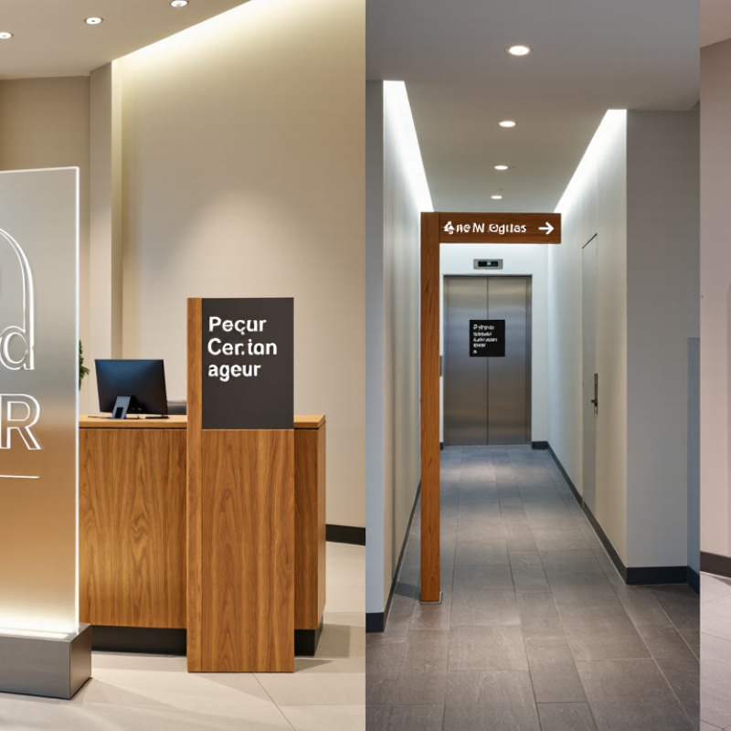
Indoor signs should match a room’s purpose, not merely fill an empty wall. In reception areas, dimensional lettering creates a calm focal point. It also helps visitors confirm they have arrived. Acrylic panels suit offices needing a clean, lightweight surface. Wood-look plaques add warmth, but may feel too informal in medical or financial settings. Viewing distance matters more than a sample photo. Test readability across the actual lobby.

Directional signs work well in corridors, elevators, and shared buildings. Use strong contrast, clear arrows, and short wording. Suspended signs help open retail floors with limited wall space. Door signs should identify rooms quickly. Accessibility information belongs at a comfortable viewing height. Digital displays suit changing menus, schedules, and announcements. They offer flexibility, though glare, updates, and power outages require planning. Static signs remain dependable. That detail is easy to miss.

In restaurants, backlit menu boards improve evening readability, but polished counters may create distracting reflections. Magnetic boards support frequent changes in classrooms and training rooms. Reception desks benefit from compact panels that do not block staff visibility. Choose matte finishes near windows and durable surfaces in busy corridors. Check mounting strength, cleaning methods, and color contrast before ordering. One mistake I still see is choosing signs by appearance alone. Measure traffic patterns and ask users what they notice first. Some choices will need revision. That is normal.

How to Choose Indoor Business Signs in 2026? - Compare Indoor Sign Types for Different Business Spaces

Sign Type Best-Fit Business Spaces Primary Purpose Typical Materials Illumination Typical Cost Range* Expected Service Life** Key Selection Consideration
Lobby Logo Sign Corporate offices, hotels, clinics, reception areas Brand identification and first impressions Acrylic, PVC, aluminum, wood veneer, dimensional letters Non-illuminated or LED backlit US$150–US$2,500 5–15 years indoors Match the sign scale and finish to the reception wall, viewing distance, and interior lighting.
Dimensional Lettering Retail stores, restaurants, salons, offices Decorative branding and feature-wall communication Acrylic, metal, PVC, foam, wood, painted MDF Usually non-illuminated; optional halo lighting US$100–US$1,800 3–10 years indoors Choose letter depth, color contrast, and mounting method according to the wall surface and desired visual impact.
Wayfinding Signs Hospitals, campuses, hotels, shopping centers, large offices Directing visitors to rooms, departments, exits, and facilities Aluminum, acrylic, PVC, laminated panels, vinyl graphics Generally non-illuminated; illuminated options for low-light areas US$40–US$600 per sign 5–12 years indoors Prioritize consistent symbols, readable typography, strong contrast, and placement at decision points.
ADA-Compliant Room Signs Public buildings, offices, schools, healthcare facilities, hotels Accessible room identification and regulatory compliance Acrylic, photopolymer, aluminum, tactile plastic Non-illuminated US$35–US$250 per sign 5–15 years indoors Verify applicable local accessibility requirements for tactile characters, braille, contrast, and installation height.
Menu Boards Cafés, restaurants, food courts, bars, quick-service counters Displaying products, prices, promotions, and ordering information Printed PVC, acrylic, aluminum composite, wood, digital displays Non-illuminated or digital backlit display US$80–US$2,000 2–8 years, depending on format and update frequency Select a replaceable or digital format when prices and product offerings change frequently.
Window Graphics Retail storefronts, gyms, offices, clinics, service businesses Promotions, privacy control, operating hours, and visual branding Perforated vinyl, clear film, opaque vinyl, frosted film Uses ambient light; optional LED window lighting US$5–US$25 per square foot 2–7 years indoors Consider transparency, adhesive removability, cleaning exposure, and whether both sides of the glass need messaging.
Safety and Regulatory Signs All commercial, industrial, educational, and public facilities Communicating hazards, emergency information, restrictions, and required actions Aluminum, rigid plastic, photoluminescent material, adhesive vinyl Non-illuminated; photoluminescent or illuminated where required US$10–US$300 per sign 3–10 years indoors Use current code requirements, standardized colors and symbols, and materials suited to the environmental conditions.
Digital Display Signage Retail stores, transportation areas, reception spaces, entertainment venues Dynamic promotions, announcements, schedules, and multimedia content LCD or LED screen, metal enclosure, tempered glass, mounting hardware Self-illuminated US$300–US$5,000+ per display 5–10 years, depending on operating hours and maintenance Budget for content management, power consumption, network access, ventilation, and ongoing technical support.
Freestanding Directory Sign Office buildings, medical centers, malls, campuses, co-working spaces Listing multiple tenants, departments, floors, or services Aluminum, acrylic, wood, tempered glass, modular inserts Non-illuminated or internally illuminated US$500–US$4,000 5–15 years indoors Choose a modular panel system if tenants, departments, or room assignments are likely to change.

Planning notes:

* Cost ranges are broad U.S. market estimates for typical indoor sign projects and may vary by size, quantity, design complexity, installation, electrical work, accessibility requirements, and region.

** Service life depends on material quality, indoor humidity, sunlight exposure, cleaning methods, operating hours, and maintenance.

For a complete sign program, combine brand identification, wayfinding, accessibility, safety, and promotional signs according to the visitor journey through the space.

Select Materials, Sizes, Colors, and Fonts for Clear Communication

How to Choose Indoor Business Signs in 2026?

Select Materials, Sizes, Colors, and Fonts for Clear Communication

Indoor signs should guide people without making them stop and guess. From my experience, matte acrylic, aluminum, wood, and rigid PVC each serve different spaces. Acrylic looks polished, while aluminum handles busy corridors better. Wood adds warmth, but it may not suit damp areas. Choose a surface that matches cleaning routines, lighting, and daily contact.

Measure the viewing distance before selecting a sign size. A reception sign can be compact, but directional signs need stronger visibility. Place them near decision points, such as elevators, entrances, and hallway turns. Keep essential wording short. Three to seven words often work well. Too much information becomes visual noise.

Color contrast affects communication more than decoration. Use dark lettering on a light background, or the reverse. Test samples under the actual indoor lighting. Colors can appear weaker beneath warm bulbs. Fonts should be simple, open, and easy to read from several meters away. Avoid thin strokes and overly decorative letterforms. They often fail in real spaces.

I once approved a beautiful narrow font that looked unclear from the lobby. That mistake changed my process. Now, I print full-size samples and ask several people to read them while walking. Their feedback can expose problems I miss. Include tactile or high-contrast features where practical, especially for visitors with limited vision. Requirements vary by location, so confirm current accessibility guidance before production.

Check Accessibility, Safety Rules, and Brand Consistency

Choosing indoor business signs in 2026 requires more than matching colors and fonts. Accessibility should guide every decision. The World Health Organization’s World Report on Vision estimates that at least 2.2 billion people have vision impairment. Clear contrast, readable type, tactile lettering, and well-positioned signs can reduce confusion. Follow WCAG 2.2 principles where digital displays appear. Check local accessibility codes before installation. A beautiful sign can still fail when glare hides the text.

Safety rules need equal attention. Signs should not block exits, fire equipment, sprinklers, or accessible routes. Use recognized safety colors and symbols, such as those described in ISO 7010. Local fire authorities may also require specific materials, mounting heights, or emergency wording. Measure the hallway, not only the wall. A sign that projects several inches can create a real collision risk. The mistake is easy to miss during design reviews.

Tips: Test signs at eye level and from a wheelchair. View them under bright and dim lighting. Ask someone unfamiliar with the building to find a room. Note where they hesitate. Keep brand colors consistent, but adjust contrast when needed. A 2019 brand-consistency industry report found that consistent presentation can increase revenue by up to 33%. That figure is useful, not universal. Accessibility and safety should override decorative preferences when the two conflict.

Set a Budget and Choose the Right Sign Installation Method

How to Choose Indoor Business Signs in 2026?

Set a Budget and Choose the Right Sign Installation Method

Start with the complete cost, not only the sign face. Include design, materials, lighting, wiring, delivery, installation, maintenance, and future removal. A practical budget often works best when divided into three parts: production, installation, and contingency. Reserve at least 10% for surprises. Measurements are sometimes wrong. Walls can also hide difficult surfaces.

Your installation method should match the building, sign weight, and customer movement. Wall-mounted acrylic or metal signs suit corridors and reception areas. Suspended signs improve visibility in open ceilings, but they need secure overhead supports. Freestanding displays offer flexibility, although they require floor space and stable bases. Adhesive mounting is inexpensive for lightweight graphics, but it may fail on dusty or textured walls. Request a site survey before approving the design.

Professional data supports careful sign planning. A FedEx Office and KRC Research consumer survey found that 76% of people entered a store they had never visited because of its signs. The same survey reported that 68% believed signage reflected business quality. The Sign Research Foundation’s research on on-premise signage also links visible signs with customer awareness and business value. These findings do not guarantee sales. They do show why installation visibility matters. A sign hidden behind a doorway wastes part of the budget. My own planning mistake would be choosing appearance before access, safety, and maintenance. A beautiful sign can become expensive when replacing one lamp requires special equipment.