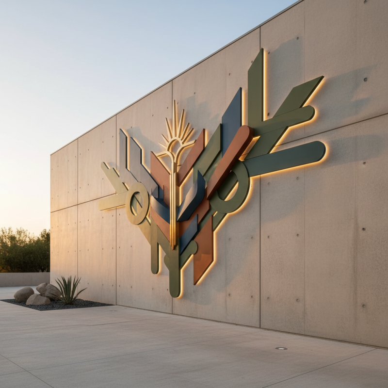
Top 10 Tips for Designing a Business Logo Wall Sign That Stands Out
Creating a striking Business Logo Wall Sign is crucial for brand visibility. According to a recent survey by the Graphics & Signage Association, 70% of consumers form a judgment about a company based on its signage. A well-designed logo can enhance brand recognition and attract more customers.
However, not every sign hits the mark. Many business owners overlook essential design aspects. Common mistakes include choosing poor color schemes or overcrowding the sign with information. In fact, studies indicate that simple designs increase retention by 80%.
The right Business Logo Wall Sign should tell your brand's story at a glance. Consider your target audience and what resonates with them. Reflect on your current sign's impact. Is it distinct or easily forgotten? Revisiting these basics is key to making a memorable impression. The journey of design involves continuous learning and adaptation.
Understanding the Importance of a Business Logo Wall Sign
A business logo wall sign is more than just an identifier. It serves as a visual anchor for your brand. According to a study by the Design Council, consistent branding can increase revenue by up to 23%. This highlights the importance of having a well-designed logo sign. When customers enter your space, the logo should capture their attention. It should communicate your brand’s values effectively.
Visibility matters. A study by the Small Business Administration found that nearly 50% of consumers believe a sign indicates the quality of a business. This means your wall sign should not only look good but also convey professionalism. Colors, fonts, and materials all play a crucial role. For example, bright colors can attract attention, but they must fit your brand personality. A mismatch can leave potential customers confused.
Consider longevity and wear and tear. Poorly made signs can tarnish your reputation. A report from FedEx Office reveals that 76% of people have entered a store because of its signs. If your sign is faded or damaged, it may drive customers away. Investing in quality materials is essential. Reflecting your brand identity should be done thoughtfully. Each element of your logo wall sign can tell a story, but it must be a story people want to hear.
Elements of Effective Logo Design for Wall Signs
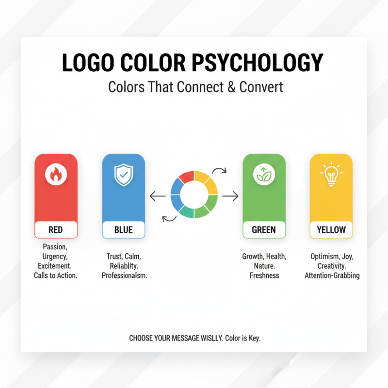
When designing a logo wall sign, focus on the elements that create effective visual communication. Start with color. Choose hues that reflect your brand’s personality. Bold colors can grab attention, while softer tones convey calmness. Contrast is essential. A well-chosen contrasting color can make the logo pop against its background.
Next, consider typography. Fonts should be legible from a distance. Avoid overly decorative styles that clutter the message. Instead, opt for clean and modern fonts. This choice enhances readability. Size also matters; larger letters ensure visibility. Experiment with spacing to find a perfect balance. Sometimes, less is more. Overcrowding with too many elements risks losing clarity.
Don’t neglect the importance of shape. Simple shapes can be more memorable. They often stick in the viewer's mind longer than intricate designs. Think about the composition. A centered logo is balanced, but off-center designs can create dynamic interest. Reflection on these aspects allows for continual improvement. Every new concept might lead to better results. Each revision provides a chance to refine and enhance your wall sign's impact.
Top 10 Elements of Effective Logo Design for Wall Signs
This chart depicts the importance of various elements in designing a logo for wall signs based on industry feedback. The data illustrates how different attributes contribute to a logo's effectiveness and appeal in a business environment.
Choosing the Right Materials for Durability and Impact
When it comes to designing a business logo wall sign, choosing the right materials is crucial. Durable materials ensure that your sign can withstand the elements. Consider options like metal, wood, or acrylic. Each material brings unique qualities to the table. Metal is robust and offers a sleek look. Wood gives a warm, natural feel, while acrylic can be lightweight but still striking.
Furthermore, think about the finish of your sign. A matte finish can provide an understated elegance. On the other hand, a glossy finish might catch the eye more effectively. Balance aesthetics with practicality. Remember, signs are exposed to various weather conditions. Will the materials fade? Will they chip easily? These questions require careful consideration.
Reflect on your choices. It’s easy to go for what looks good today, but durability matters. A beautiful sign that deteriorates quickly isn't an asset. Test samples where possible to see how they hold up over time. Ultimately, a well-chosen material will enhance your brand's presence and longevity. Avoid rushing this decision; it needs thought and effort.
Top 10 Tips for Designing a Business Logo Wall Sign That Stands Out
| Tip # |
Tip Description |
Recommended Materials |
Expected Durability |
Visual Impact Level |
| 1 |
Choose a simple design that is easily recognizable |
Acrylic, Aluminum |
5-10 years |
High |
| 2 |
Use contrasting colors for visibility |
Vinyl, Composite materials |
3-7 years |
Medium |
| 3 |
Incorporate your brand’s personality |
Wood, Metal |
5-15 years |
High |
| 4 |
Make sure your logo is scalable |
Foam Board, PVC |
3-5 years |
Medium |
| 5 |
Ensure good legibility from a distance |
Backlit Signs, LED |
5-10 years |
Very High |
| 6 |
Consider environmental factors |
Outdoor-Rated Plastics |
5-8 years |
High |
| 7 |
Choose the right size for your location |
Aluminum Composite |
5-10 years |
Medium |
| 8 |
Incorporate a unique feature or dimension |
Dimensional Letters |
5-10 years |
High |
| 9 |
Test your design with potential customers |
Digital Mock-ups |
N/A |
N/A |
| 10 |
Stay true to your brand’s identity |
Any durable material |
Varies |
High |
Placement Strategies for Maximum Visibility and Engagement
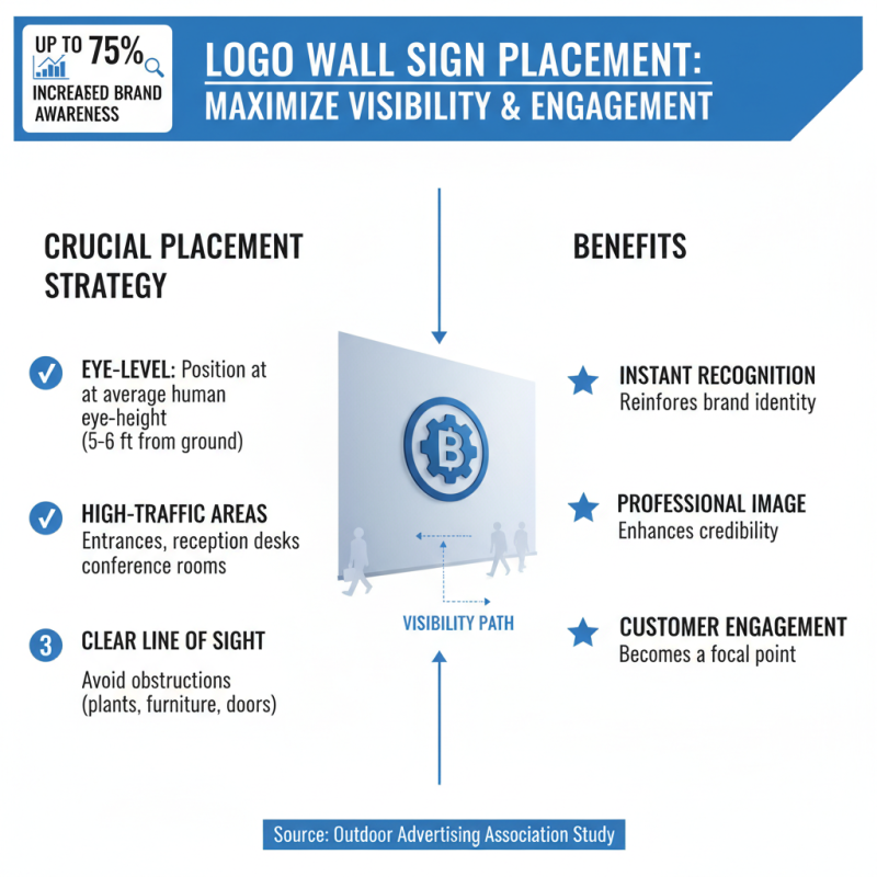
When designing a business logo wall sign, placement is crucial for visibility and engagement. According to a study by the Outdoor Advertising Association, strategically placed signs can increase brand awareness by up to 75%. Effective placement draws attention and reinforces your brand identity.
Consider positioning your sign at eye level. Signs located 5 to 7 feet from the ground attract more viewers. Also, think about lighting. A well-lit sign during evening hours can enhance visibility by 50%, making it hard to miss.
Use contrasting colors to stand out against the background. In fact, research indicates that signs with high contrast can be read from a greater distance. Regularly assess the effectiveness of your sign’s location. If foot traffic patterns change, your sign placement might need to adapt. Test different locations for maximum impact. Remember, the placement isn't a one-size-fits-all solution; it requires tweaking and adjustments.


 Inquiry
 Email
Email WhatsApp