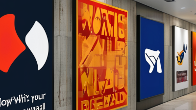
Top Tips for Choosing Business Logo Wall Signs That Stand Out?
Choosing the right Business Logo Wall Signs can significantly impact your brand visibility. According to Jane Anderson, a renowned branding expert, “Your logo sign is often the first impression customers will have of your business.” This highlights the importance of selecting an eye-catching design.
Wall signs need to communicate your brand message effectively. A well-designed logo attracts attention while conveying your company’s values. Avoid overly complicated designs. Simple logos often stick in customers' minds. Remember, clarity is crucial in this crowded market.
Some may overlook the durability of materials. High-quality materials ensure that your logo stands strong against the elements. Consider the location of your signs as well. Visibility matters; a great sign in the wrong spot will not serve your brand well. Careful planning and thoughtful design are essential.
Understanding the Importance of a Distinctive Business Logo Wall Sign
A distinctive business logo wall sign plays a crucial role in brand identity. It acts as a visual anchor, capturing attention and conveying what your business stands for. The design must evoke an immediate response. Customers should easily associate your sign with your core values. An eye-catching logo can lead to increased foot traffic and customer loyalty.
Choosing the right colors and fonts is essential. Bright, contrasting colors can make your logo pop. However, keep it cohesive with your overall brand palette. Fonts should be legible from a distance. Decorative fonts may be trendy, but clarity is key. Think about how your sign will look in different lighting situations.
Simplicity often proves effective. A cluttered design may confuse potential customers. Consider the surrounding environment as well. Your sign should enhance the space, not overwhelm it. A well-placed sign in a busy setting stands out more. Reflect on how your logo impacts your first impression. A thoughtful, distinctive logo sign invites customers to learn more about your business.
Evaluating Different Materials for Logo Wall Signs
Choosing the right material for your logo wall sign is crucial. Different materials can convey various messages about your brand. For instance, acrylic offers a sleek and modern appearance, ideal for contemporary businesses. Its lightweight nature makes installation easy, but it can scratch easily and may not withstand harsh weather conditions.
Metal signs, on the other hand, exude durability and professionalism. They can be finished in various ways, such as brushed or polished. However, they often require more effort to install and may come at a higher cost. Wood can add warmth and a unique character, suitable for artisanal brands. But wood is prone to moisture damage, limiting its use in certain environments.
Don't forget about the impact of finish and color when selecting materials. Matte finishes absorb light and may convey a more subdued brand image. Glossy finishes reflect light, which can make colors appear more vibrant. Each choice should align with your brand's identity. It’s essential to weigh your options and consider the longevity and aesthetics of each material carefully. What may seem appealing in one context might fall short in another. Reflect on your location and audience to make an informed decision.
Choosing the Right Colors and Typography for Visibility
Choosing the right colors and typography for business logo wall signs is crucial for visibility. Colors evoke emotions and can influence customer perceptions. For example, bold colors like red and yellow grab attention, while blue conveys trust. It’s important to think about your brand’s personality when selecting colors. Test different combinations to find what resonates with your audience.
Typography plays a vital role in legibility. Simple, sans-serif fonts are often the most readable from a distance. Consider varying font sizes for emphasis. Mixing too many styles can create confusion. Remember, less is more when designing signs. Keep in mind, what looks good on a computer screen may not translate well to a physical sign.
Reflecting on your design choices matters. Gather feedback from potential customers or team members. You may discover that your initial idea doesn’t communicate effectively. Adjust your colors and fonts based on their insights. A little imperfection in your design can lead to better solutions. Embrace the learning process as you create a standout logo wall sign.
Incorporating Brand Identity into Logo Design
Creating a powerful logo is essential for establishing a business’s identity. Research shows that colors can increase brand recognition by up to 80%. A logo that reflects your brand's essence can help potential customers connect with your products. When developing a logo, consider how it communicates your brand values and mission. Consumers are more likely to engage with brands that resonate with them.
Designing a logo that stands out requires strategic thought. Keep your design simple yet evocative. Think about the shapes and colors you use. For example, using warm tones can invoke feelings of friendliness and approachability. Aim for versatility as well; your logo should look good in various sizes and formats. Regular review of design trends can also enhance your approach.
A noteworthy insight from design professionals indicates that logos with unique typography can increase recall by 33%. Focus on the originality of your typeface. Experiment with custom fonts to enhance uniqueness. Remember, a logo should not be static. Brands must evolve, yet the core identity remains. Assess feedback from customers regularly to refine your logo and ensure it continues to resonate.
Top Tips for Choosing Business Logo Wall Signs That Stand Out
| Tip |
Detail |
Considerations |
| 1. Understand Your Brand Identity |
Identify the core values and messages you want your logo to convey. |
Consider the target audience and market positioning. |
| 2. Choose the Right Colors |
Select colors that reflect your brand’s personality and evoke the right emotions. |
Avoid using too many colors; stick to a simple palette. |
| 3. Keep It Simple |
Design a logo that is easy to recognize and remember. |
Complex designs can be distracting; opt for minimalism. |
| 4. Ensure Scalability |
Create a logo that looks good in any size, whether on a business card or a large sign. |
Test the design at various sizes before finalizing. |
| 5. Seek Feedback |
Gather opinions from team members and potential customers on your logo design. |
Ensure that the logo resonates well with the intended audience. |
Placement Strategies for Maximum Impact of Wall Signs
When it comes to wall signs, placement is key to ensure maximum visibility and impact. According to a recent study by the Sign Research Foundation, 76% of consumers reported entering a business they had never visited before simply because of its signage. This highlights the importance of strategic placement. Signs should be placed at eye level and positioned where they capture attention, such as near entrances or high-traffic areas.
Consider the environment when choosing a location. Signs can blend into the background if not positioned correctly. Utilizing contrast can help signage stand out. Bright colors against neutral walls attract the eye. Moreover, the size of the sign should be appropriate for its placement. A small sign might get lost on a large wall, while an oversized sign could overwhelm the space.
Another essential element of effective placement is angle. Signs viewed from multiple angles have a higher chance of being noticed. Some businesses opt to place signs at strategic turns or intersections to capitalize on foot and vehicle traffic. Remember to assess how signs look from different viewpoints. Regularly reviewing their visibility is necessary for long-term effectiveness. Engaging with your audience through well-placed signage can lead to higher customer interaction and greater brand awareness.



 Inquiry
 Email
Email WhatsApp