Leave Your Message

10 Essential Tips for Effective Office Building Signs Design

In today's competitive real estate market, effective signage is crucial for office buildings. Over 60% of visitors form their first impressions based on building signs. This highlights the importance of well-designed Office Building Signs. A study indicates that clear and attractive signage can increase foot traffic by up to 20%. This makes it vital for property owners and managers to invest in thoughtful design.

Office Building Signs serve more than an aesthetic purpose. They direct, inform, and promote a building's identity. Poorly designed signs can lead to confusion and frustration. For instance, 70% of customers report difficulty finding offices without clear directions. A focused approach to signage design can help bridge this gap, enhancing overall user experience.

Despite the growing awareness of physical branding, many office buildings still overlook key design principles. It’s important to reflect on existing signage and ensure it resonates with the audience. Is your signage delivering the intended message? Engaging with experts in the field could lead to transformative results, making office environments more welcoming and effective.

10 Essential Tips for Effective Office Building Signs Design

Understanding the Importance of Office Building Signage in Branding

Office building signage plays a crucial role in branding. It goes beyond mere navigation. Effective signage helps create a first impression. According to a report from the Sign Research Foundation, nearly 76% of people enter a business they’ve never visited before based solely on its signs. This highlights the visibility and impact of signs on attracting potential clients.

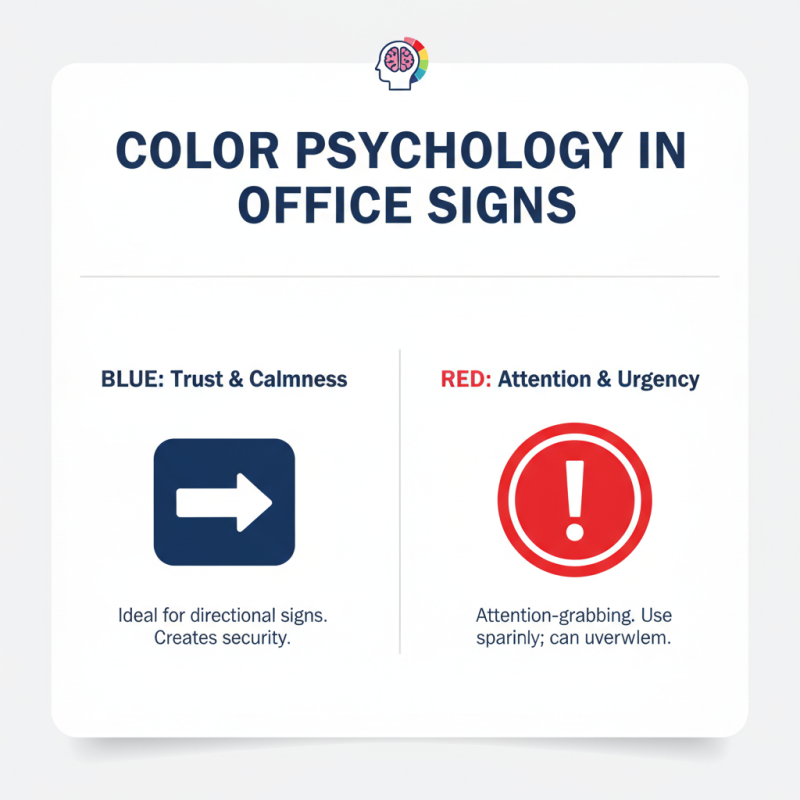
Good signage enhances brand recognition. Studies suggest that consistent branding across all touchpoints can increase revenue by 23%. However, many offices overlook design elements. Poorly designed signs can confuse visitors. They may not reflect a company's ethos. For instance, not using legible fonts can detract from professionalism. A mismatched color palette can contradict brand values. These oversights may alienate clients and reduce trust.

Signage isn't just for aesthetics; it’s part of a larger strategy. It should resonate with the audience. Also, signs should convey clear messages. Research indicates that 68% of customers believe that the design of a sign reflects the quality of a business. So, it’s essential to approach signage thoughtfully. Consider every detail. The right design can communicate a company’s essence and draw in clients effectively.

Key Design Principles for Effective Office Signs: Legibility and Visibility

Creating effective signs for office buildings hinges on the principles of legibility and visibility. Clear design helps visitors navigate your space effortlessly. Using high-contrast colors can enhance readability. For instance, dark text on a light background is often easier to read from a distance.

Tip: Choose fonts that are easy to read. Sans-serif fonts tend to work best, as they are modern and simple. Make sure your font sizes vary effectively. Important signs should be larger and more visible. Avoid clutter; the more elements you include, the harder it becomes to focus on the message.

Visibility is equally important. Ensure your signs can be seen from various angles. Place them at eye level. Natural light can affect visibility, so test signs at different times of the day. Reflect on the design choices you make. Sometimes, what seems bold may actually hinder visibility. Evaluate your signage effectiveness regularly to ensure it meets the needs of your visitors.

10 Essential Tips for Effective Office Building Signs Design

Utilizing Color Psychology in Office Signs to Enhance Communication

10 Essential Tips for Effective Office Building Signs Design

Color psychology plays a crucial role in designing office signs. Different colors evoke specific emotions and reactions. For example, blue often represents trust and calmness, making it ideal for directional signs. A well-placed blue sign can create a sense of security. In contrast, red is attention-grabbing and can suggest urgency. However, too much red can overwhelm the viewer.

Choosing the right color is not always straightforward. It requires a deep understanding of your audience. Consider the nature of your office environment. A creative space might benefit from vibrant colors that inspire energy. A more corporate setting may call for muted tones that convey professionalism. Testing various color combinations can lead to insightful discoveries. Sometimes, the results may not align with initial expectations. It's essential to evaluate the impact objectively.

Designing office signs is an iterative process. You might need to adjust colors based on feedback. Observing how employees and visitors react is vital. Remember, not every color will resonate with everyone. Strive for balance. Effective communication through signage is key, and color choices should support that goal.

Incorporating ADA Compliance in Office Signage for Accessibility

Designing office building signs requires careful consideration of accessibility. ADA compliance is crucial to ensure everyone can navigate your space. Signs should be placed at eye level. This makes them easier to read for people of all heights. Use clear fonts and high contrast colors to enhance visibility. This attention to detail can be the difference between ease and frustration for a visitor.

Incorporating tactile elements helps in creating a welcoming environment. Raised letters and Braille need to be included on all directional signs. Yet, many businesses overlook these details. It’s vital to test the signs with people who have visual impairments. Gather their feedback to improve the design. Are the signs too cluttered? Simplification may be necessary to meet their needs.

Additionally, don't forget about the power of symbols. Universal symbols can guide individuals who may not speak the same language. However, using too many icons can confuse rather than assist. Strive for a balance that enhances navigation without overwhelming the viewer. Regular assessments of your signage will ensure it stays relevant and functional.

10 Essential Tips for Effective Office Building Signs Design - Incorporating ADA Compliance in Office Signage for Accessibility

Tip Number Tip Description ADA Compliance Element Design Consideration
1 Use clear and legible fonts. Font size to be at least 5/8 inch tall. Choose sans-serif fonts for readability.
2 Ensure high contrast between text and background. Contrast ratio of at least 4.5:1. Use dark text on light backgrounds or vice versa.
3 Incorporate tactile elements for identification. Braille and raised characters for navigation. Ensure tactile dots are at least 1/32 inch high.
4 Keep signage at appropriate height. Bottom of signs should be 48 inches from the floor. Align signs to be within the line of sight.
5 Use pictograms where applicable. Pictograms should be easily recognizable. Ensure pictograms are placed above text.
6 Consider the location and visibility of signs. Must be installed at key decision points. Avoid obstructions that block view of the signage.
7 Regularly maintain signage for durability. Signs must not fade, chip, or deteriorate. Conduct regular inspections and updates.
8 Label rooms clearly with unique identifiers. Names and numbers should be distinct. Consider using an easy numbering system.
9 Provide directional signs to assist navigation. Must follow the flow of pedestrian traffic. Use arrows and clear wording for directions.
10 Engage with individuals with disabilities when designing. Gather feedback for more effective signage. Incorporate user experiences into design decisions.

Selecting Durable Materials for Long-Lasting Office Signage Solutions

Choosing the right materials for office signage is crucial. It's not just about looks; durability matters too. Signs must withstand weather and daily wear. Think about environments like offices with heavy foot traffic. Different materials serve different purposes. Metal and acrylic are popular choices for their robustness and sleek aesthetics. Wood can offer warmth but may require more maintenance.

Consider the visual impact as well. The right material affects visibility. A well-constructed sign can last for years. On the other hand, a poor choice can lead to fading and damage. For example, a vinyl sign may look great initially but can deteriorate under UV exposure. Reflect on the long-term costs versus upfront savings. Investing in high-quality materials may seem daunting but pays off.

Also, think about the installation process. Some materials need special mounting, while others are easier to handle. Ensure your team is prepared for this. Sometimes, the most straightforward choices are the most effective. Experiment with textures and finishes until the right combination emerges. Finding balance between form and function is key. Each decision shapes the overall impression of your office space.