Essential Tips for Creating a Business Sign That Attracts Customers?
Creating an eye-catching Business Sign is crucial for attracting customers. Sarah Thompson, a leading expert in business branding, once stated, "Your sign is your silent sales representative." This underscores the importance of having an effective sign. A well-designed Business Sign can draw attention and invite potential customers inside.
Consider the colors, fonts, and shapes used in sign design. They must reflect your brand's identity. For instance, bright colors can attract attention, while simple designs may convey professionalism. Many businesses overlook these elements, resulting in signs that fail to engage.
Imagery also plays a key role. Using relevant visuals can evoke emotions and create connections with the audience. However, some signs can be cluttered or difficult to read, leaving potential customers confused. Reflecting on your Business Sign's design is essential to ensure it meets your goals and resonates with your target audience.

Key Elements of an Effective Business Sign
Creating an effective business sign is crucial for drawing customers in. The design should be eye-catching and convey your brand's message clearly. Use bold colors that contrast well. Avoid overly complicated graphics. Simplicity often stands out more effectively.
One important tip is to ensure your text is legible from a distance. Use large fonts and limit the number of words. Consider the view points of potential customers. Their perspective can vary greatly. If they cannot read your sign, it’s not doing its job.
Incorporate images relevant to your business. A picture can grab attention quickly. However, make sure they are high quality. Faded or blurry images reflect poorly on your brand. Regularly review your sign's effectiveness. Customers may see it differently over time.
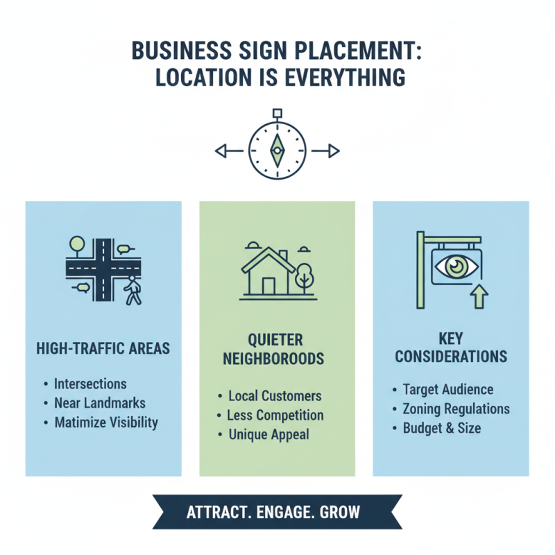
Choosing the Right Location for Maximum Visibility
When it comes to placing your business sign, location is everything. A well-placed sign can attract foot traffic and draw in potential customers. Consider high-traffic areas where visibility is guaranteed. Think about intersections or locations close to popular landmarks. However, don't just rely on busy streets. Sometimes, quieter neighborhoods can yield better results.
Evaluate the surroundings of your chosen location. Look at competing businesses and their signage. Are they well-lit? Are their designs eye-catching? Take notes of what works and what doesn't. It may be tempting to stick your sign in a corner, but don’t ignore that prime real estate near the entrance. Visibility can make or break customer engagement.
Lastly, reflect on the height and angle of your sign. High signs may communicate authority, but they can also become easily overlooked. A sign that's too low might not be seen by passing cars. Adjusting height is often a balancing act. Finding the sweet spot can be an ongoing process, requiring tests and tweaks. Engage with your audience and listen to their feedback. This ongoing reflection can refine your approach and enhance visibility over time.
Design Principles: Color, Font, and Graphics Considerations
Color, font, and graphics are key aspects of a business sign. Research shows that 85% of customers make a snap judgment based on color alone. Bright colors can catch the eye. However, too many colors can be overwhelming. A balanced palette helps convey the brand's message effectively.
Fonts also play a crucial role. They should be legible from a distance. A study indicates that 70% of people remember a business name better when it's presented in an easy-to-read font. Yet, some businesses rely on trendy fonts, which can hurt readability. This creates a disconnect with potential customers. Simplicity often wins over complexity.
Graphics can enhance the appeal. Visuals should align with the brand identity and message. Overcomplicating designs might distract from essential information. A clear logo and minimal imagery can improve recognition. Striking the right balance is essential. Be aware of the impact design choices have on customer perception. Each element should serve a purpose and draw attention without causing confusion.
Incorporating Brand Identity into Your Signage
Creating a business sign is crucial for attracting customers. A well-designed sign should reflect your brand identity. What do you want your customers to feel? Think about colors, fonts, and logos. Each element should evoke the essence of your brand. For instance, bold colors might suggest energy, while softer tones could convey calmness.
Incorporate brand identity into your signage. Use shapes and images that resonate with your offerings. If you operate a café, consider coffee cup graphics or a warm font. These details matter. They communicate your message before customers even walk through the door. However, it's easy to overlook the importance of clarity and simplicity.
Sometimes, less is more. Overly complicated designs can confuse customers. Reflect on your sign's functionality. Is it easy to read from a distance? Is your brand name prominent? Regularly revisiting your signage is essential. Make adjustments if needed to keep your brand fresh and appealing. Experiment, gather feedback, and be open to making changes.
Strategies for Making Your Sign Stand Out in a Crowd
When creating a business sign, clarity is key.
A potential customer should instantly grasp what you offer. Use
bold fonts that are easy to read from a distance.
Ensure high contrast between text and background.
For example, white letters on a dark blue background work well.
Don’t overcrowd the sign. Keep it simple;
too much information can confuse people.
Color choices can influence consumer behavior.
Bright colors like red or yellow
attract attention but should be used wisely. Neon shades might seem fun but can be overwhelming.
Consider the vibe of your business. A cozy café might opt for warm tones,
while a tech store could use cooler, modern shades.
Also, think about placement. A sign high up may look great but could be missed by someone passing by.
If it's near pedestrian traffic, make sure it's eye-catching and at eye level.
Remember to reflect on what you want to communicate. Is your message clear?
When was the last time someone commented on your sign?
Feedback can guide improvements, even when it feels uncomfortable to ask.


 Inquiry
 Email
Email WhatsApp