How to Create an Eye Catching Business Logo Wall Sign?
Creating a captivating Business Logo Wall Sign is essential for any brand. According to branding expert Sarah Mitchell, “A logo is the face of a business.” This statement emphasizes the importance of an effective visual presence. A well-designed wall sign isn’t just decorative; it communicates your brand message.
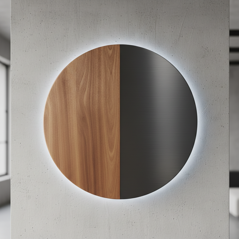
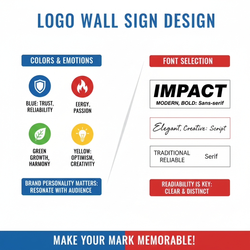
To create an eye-catching Business Logo Wall Sign, consider the colors, fonts, and materials. Vibrant colors attract attention, while clear fonts enhance readability. For instance, a wooden sign might evoke a rustic feel, while a sleek metal sign gives a modern vibe. Each choice should reflect your brand's identity.
Reflecting on past mistakes can improve your design process. Perhaps an old logo was too complex, losing clarity. Avoid overcomplicating your Business Logo Wall Sign. Simplicity often leaves a stronger impact, enabling your audience to remember your brand.
Understanding the Importance of a Business Logo Wall Sign
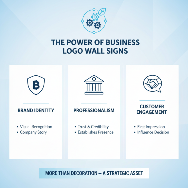
A business logo wall sign serves more than just a decorative purpose. It represents brand identity and professionalism. A well-designed sign catches attention and can communicate your business values. An effective logo can tell a story at a glance. When customers see your logo, they form their first impressions. This can greatly influence their decision to engage with your brand.
Creating a compelling wall sign isn't always easy. Many businesses struggle with design choices. Color, font, and size can convey different messages. A vibrant color might attract attention but may not align with a serious brand image. Simplicity is key, yet too simple can appear unprofessional. You need to strike a balance that reflects your business essence. Engaging a designer can help, but sometimes collaboration is needed to avoid misalignment.
Observation is crucial when designing your sign. Look at competitors’ signs; some are effective, while others are not. Identify what works in your industry. Consider your audience and their preferences. Get feedback on early designs. Be open to criticism and make necessary adjustments. Revisiting the design process can lead to improvements. A logo wall sign should evolve, just as your business does.
Identifying Your Brand's Core Values and Message
Identifying your brand's core values is crucial for creating a business logo that resonates. According to a study by Nielsen, 66% of consumers prefer brands with a clear purpose. Your logo should reflect your mission and values. This makes it easier for customers to connect and engage with your brand. Consider how your logo can communicate these values visually. Is it bold? Subtle? Each choice sends a message.
One tip is to brainstorm keywords that describe your brand's essence. Focus on words that evoke emotion. For example, if your brand values sustainability, think of earthy tones and natural shapes. These elements can enhance your message significantly. Reviewing competitor logos can also provide insight. Analyze what works and what falls flat. This reflection can inspire unique ideas.
Creating a logo isn't just about aesthetics. It’s about communication. Brands that successfully convey their core values tend to foster loyalty. A survey from HubSpot indicates that 81% of consumers need to trust a brand before making a purchase. Ensuring your logo aligns with your values increases that trust. Don't rush the process. Reflect on what truly matters to your brand before finalizing your design.
Understanding Brand Core Values
This chart illustrates the importance of various core values in shaping a business’s brand identity. Each bar represents a percentage indicating how crucial each value is perceived to be by business owners.
Incorporating Unique Design Elements to Make It Stand Out
Creating a business logo wall sign that captivates attention requires thoughtful design elements. One essential aspect is color choice. According to a study by the Institute for Color Research, color can increase brand recognition by up to 80%. Different colors evoke emotions, influencing customer perception. For instance, blue conveys trust, while red signifies excitement. Mixing these colors strategically can create a powerful visual impact.
Incorporating unique design elements adds to the logo's appeal. Consider integrating geometric shapes or authentic textures that align with your brand identity. A report from Design Council suggests that 94% of first impressions relate to visual aesthetics. Simple yet effective graphics can make your sign memorable. However, balancing creativity with simplicity is key. Overly complex designs may confuse customers.
Reflecting on layout, the arrangement affects visibility. A sign should be easily readable, even from a distance. Research indicates that well-placed logos can improve recognition by 30% in retail environments. Experimenting with fonts and spacing is necessary, but avoid clutter. Crafting a striking logo sign involves a blend of creativity, strategic thinking, and ongoing refinement.
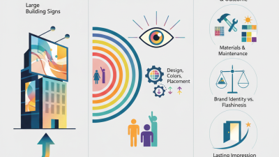
Selecting Appropriate Materials and Placement for Visibility
Creating an eye-catching business logo wall sign begins with selecting the right materials. Durable options like acrylic and aluminum resist weather and fading. According to a recent industry report, 70% of consumers will remember a brand thanks to its signage. Choosing materials that withstand wear helps assure longevity and visibility.
Placement is crucial for ensuring your sign catches attention. An ideal height for wall signs is between 5 to 7 feet from the ground. Research shows that signs placed at eye level attract 40% more views. Consider local lighting conditions too. A well-lit sign can significantly enhance visibility, especially in the evenings.
Tips: Use contrasting colors for better legibility. Simplicity matters; too much detail can confuse viewers. Regularly evaluate the sign’s condition. Wear and tear can diminish its effectiveness. Reflect on the placement after changing any surrounding structures or landscaping. The world of signage always evolves; stay updated with trends to remain relevant.
How to Create an Eye Catching Business Logo Wall Sign? - Selecting Appropriate Materials and Placement for Visibility
| Material |
Durability |
Visibility |
Cost |
| Acrylic |
High |
Excellent |
Medium |
| Wood |
Medium |
Good |
High |
| Metal |
Very High |
Excellent |
High |
| Vinyl |
Low |
Good |
Low |
| Foam Board |
Low |
Fair |
Low |


 Inquiry
 Email
Email WhatsApp